Dark Rococo Aesthetic: Moody Walls, Gilded Mirrors & Velvet
Quick Answer
A dark Rococo aesthetic uses deep, warm wall colors (deep forest green, deep warm charcoal, dark plum) as a backdrop for ornate gilded mirrors and frames, rich textiles in velvet and silk, warm candlelit lighting, and gilded accents. The contrast of dark walls with gilded ornament creates drama that standard pale Rococo interiors do not achieve.
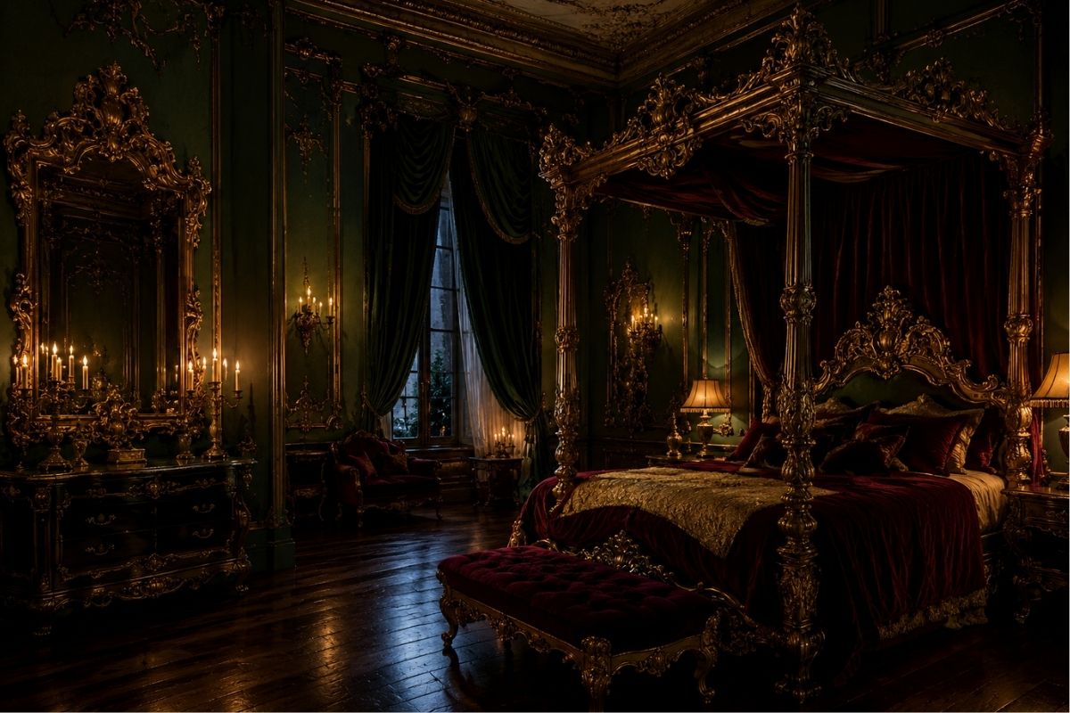
What Is Dark Rococo?
Dark Rococo is a contemporary design aesthetic that reverses the traditional Rococo palette relationship — instead of gilded ornament on pale backgrounds, it places gilded ornament against dark, richly colored walls. The result is more theatrical and dramatically atmospheric than traditional Rococo, while retaining the ornamental vocabulary that defines the style.
It is worth being clear: dark Rococo is not a historical style. The actual Rococo period (c.1715–1775) specifically rejected the dark, heavy interiors of the preceding Baroque and produced the lightest, palest, most reflective interiors yet created. Dark walls with gilded ornament is closer to some Baroque contexts than to Rococo.
The contemporary dark Rococo aesthetic borrows the ornamental vocabulary of Rococo (gilded mirrors, carved frames, shell and scroll motifs, rich textiles, multi-point warm lighting) and applies it against a dark backdrop that creates drama the original pale scheme could not produce.
What this means in practice: If you want historically informed Rococo, use the pale palette. If you want a contemporary aesthetic that is intensely atmospheric, dramatic, and characterized by rich textiles and glowing gilded detail against dark walls — dark Rococo is the more appropriate designation.
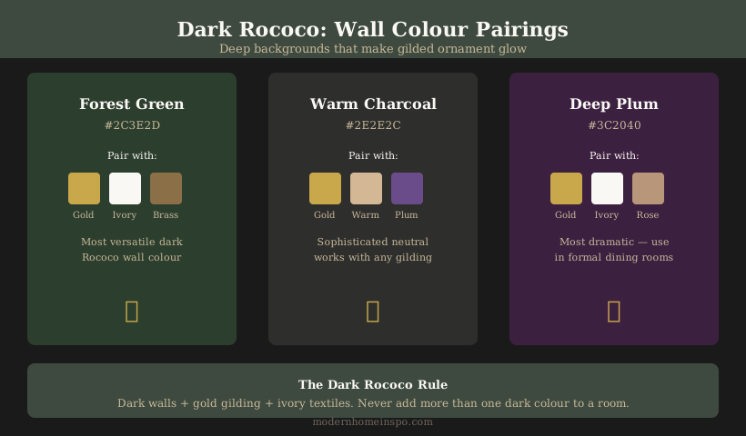
Wall Colors
The wall color is the defining decision in a dark Rococo room. The color must be:
- Dark enough to create significant contrast with gilded ornament
- Warm-undertoned (not cool, not blue-gray, not cool charcoal)
- Rich rather than muddy
The most effective dark Rococo wall colors:
Deep forest green (warm undertone): The single most effective dark Rococo choice. Forest green with a warm, slightly yellow-green undertone rather than a cool blue-green creates a rich, organic darkness that makes gold and brass glow intensely. References the natural world and avoids the cold quality of gray or black.
Deep warm charcoal: A charcoal with brown or beige undertone — sometimes called “off-black” or “warm black” — provides the most neutral dark backdrop for gilded ornament. The warmth prevents it from reading as merely dark and allows it to cohere with wood, velvet, and warm-toned objects.
Dark plum or mauve: A deep, muted purple-pink with warm undertones. More unusual and more specifically atmospheric than green or charcoal. Works particularly well in bedrooms and small intimate rooms where its romantic character is appropriate. Requires more confidence to execute.
Rich deep navy or teal: Can work if the undertone is warm-leaning (a navy with a touch of purple rather than a cool sky-blue navy; a teal with warmth rather than cool minty quality). Harder to manage than green or charcoal.
What doesn’t work: Cool gray, cool blue-black, pure black (too oppressive in most rooms), cool green-gray (reads as Scandinavian dark rather than Rococo dark).
Gilded Ornament Against Dark Walls
The key effect of dark Rococo is the contrast between dark walls and gilded ornament — a contrast that makes gilding glow in a way it cannot against pale walls.
Mirrors: A large ornate gilded mirror on a dark wall is the most dramatic available Rococo reference. The mirror reflects the room and any warm light sources; against a dark wall, it reads as a window of warmth and light. Size matters even more in a dark Rococo room — a small ornate mirror on a large dark wall reads as inadequate.
Picture and display frames: Ornate gilded frames on dark walls stand out clearly and read as architectural statements rather than decorative additions. A gallery wall of ornate gilded frames in varying sizes on a deep green wall is a highly effective dark Rococo composition.
Hardware: Muted brass drawer pulls, door handles, and cabinet hardware glow warmly against dark painted furniture or dark walls. In a dark Rococo room, hardware becomes a significant design element rather than a background detail.
Ceiling treatment: In a dark Rococo room, the ceiling is typically left in a lighter color (off-white or warm cream) rather than being painted the same dark color as the walls. This prevents the room from feeling underground and allows the ceiling to reflect the warm lighting upward into the room.
Textiles for Dark Rococo
Dark Rococo rooms require rich, substantial textiles. The lightness of linen that works in pale Rococo rooms gives way to velvet, brocade, and heavier fabric weights in a dark Rococo context.
Bedding (bedroom): Ivory or cream duvet cover as a pale contrast to dark walls. The contrast between dark walls and pale bedding is the visual core of a dark Rococo bedroom. Decorative cushions in velvet — deep jewel tones (plum, forest green, deep teal) or warm gold — add richness without competing with the walls.
Upholstery (living room): A sofa in ivory linen or cream velvet against dark walls creates the same pale-against-dark contrast. A sofa in deep velvet (forest green, plum, deep teal) against dark walls creates a more monochromatic, intensely atmospheric scheme — effective in formal sitting rooms or libraries.
Curtains: Velvet curtains in a deep tone (forest green, plum, or warm charcoal) pool slightly at the floor and add significant weight and luxury. Against dark walls, curtains in a slightly different dark tone create texture contrast without lightening the room. Alternatively, pale curtains (ivory, cream silk or linen) create a strong pale vertical element that contrasts with the dark walls.
Throws and cushions: Rich velvet in deep jewel tones, jacquard or brocade textiles with ornate patterns, silk in warm tones. The textiles in a dark Rococo room should feel substantial and rich — not light and airy.
Lighting
Lighting is more critical in a dark Rococo room than in any other interior context. Dark walls absorb light; without adequate, warm light sources, the room feels oppressive rather than atmospheric.
Bulb temperature: 2700K warm white is even more essential in a dark Rococo room than in a light one. Dark walls under cool or daylight bulbs read as cold and uncomfortable; the same walls under 2700K warm light read as deliberately moody and atmospheric.
Multiple sources: A dark room needs more individual light sources than a pale room to achieve the same functional light level. Plan for: ceiling fixture (chandelier or pendant), two bedside or task lamps, at least one accent source (wall sconce, candelabra, picture light).
A chandelier: More than in any other context, a chandelier above a dark room creates the specific Rococo atmosphere — multiple points of warm light reflected in the gilded ornament on the walls. Even a modest chandelier with warm-temperature bulbs creates this effect.
Candles: Real or high-quality LED candles on a mantel, side table, or chandelier are more appropriate in a dark Rococo room than in a pale one. The flickering warm light creates exactly the chiaroscuro effect — gilded surfaces glowing against dark backgrounds — that defines the atmosphere.
Design Tip
In a dark Rococo room, the difference between oppressive and atmospheric is almost entirely a lighting question. The same room with cool overhead light reads as dark and depressing; the same room with warm, multi-source 2700K lighting reads as dramatic and luxurious. Never use a dark Rococo room with overhead light alone.
Room Applications
Bedroom: The most natural application. Deep green or charcoal walls, ivory bedding, ornate gilded mirror, warm bedside lamps. The bedroom’s intimate function is well-served by the moody, atmospheric quality of dark walls.
Dining room: A dark Rococo dining room — with deep wall color, a chandelier above the table, and gilded mirrors or frames on the walls — is the most dramatic and theatrical application. Dining rooms are used primarily in the evening when dark walls and warm candlelight interact most effectively.
Study or library: A study with dark walls, ornate gilded frames for art and books on shelves, brass reading lamp, and heavy velvet or leather seating creates an intensely Rococo-atmospheric environment for reading and work.
Living room: Harder to execute than a bedroom or dining room because living rooms are used throughout the day in natural light. In a south or west-facing room with good natural light, dark walls in the day read as rich rather than dark; in a north or east-facing room, dark walls without natural light compensation can feel oppressive during daylight hours.
Dark Rococo vs. Gothic
The risk in dark Rococo is sliding into Gothic or goth aesthetic — which shares dark walls and ornate forms but has a different visual character and intent.
What differentiates dark Rococo from Gothic:
- Gilded warmth vs. cold metal: Dark Rococo uses warm gilded or muted brass accents; Gothic tends toward silver, iron, and dark metal.
- Organic ornament vs. architectural ornament: Dark Rococo ornament is shells, scrolls, and flowing organic forms; Gothic ornament is pointed arches, tracery, and architectural structural forms.
- Rich textiles vs. austere surfaces: Dark Rococo rooms feel rich and textile-heavy; Gothic rooms can be more austere.
- Warm light vs. cold light: Dark Rococo requires warm 2700K lighting; Gothic can accommodate cooler light sources.
The rule: if the room has an ornate gilded mirror, warm velvet textiles, muted brass accents, and 2700K warm lighting — it reads as dark Rococo. If it has iron candelabra, stone-effect surfaces, cold lighting, and architectural ornamentation — it reads as Gothic.
Frequently Asked Questions
- What is dark Rococo aesthetic?
- Dark Rococo is a contemporary design aesthetic that combines deep, moody wall colors (dark green, deep charcoal, rich plum) with the ornate gilded mirrors, carved frames, rich textiles, and warm lighting vocabulary of Rococo style. The dark backdrop makes gilded ornament glow more intensely and creates a dramatically different atmosphere than traditional pale Rococo interiors.
- Is dark Rococo historically accurate?
- No — historical Rococo interiors were deliberately pale and light. The dark Rococo aesthetic is a contemporary reinterpretation that uses Rococo ornamental vocabulary (gilded mirrors, carved frames, shell and scroll motifs, rich textiles) against a dark backdrop that has no historical precedent. Some Baroque interiors used darker backgrounds for gilded ornament, which is the closest historical reference.
- What wall colors work for dark Rococo?
- Deep forest green (with warm undertone), deep warm charcoal (brown-based, not blue-black), dark plum or mauve (warm-undertoned), and rich deep teal (warmer side) all work for dark Rococo. The key is warm undertone in the dark color — cool dark colors (blue-black, cool charcoal, cool gray-green) produce a colder, more Scandinavian dark aesthetic rather than dark Rococo.
- Can dark Rococo work in a bedroom?
- Yes — a dark Rococo bedroom is one of the most effective applications. Deep green or warm charcoal walls with ivory bedding, an ornate gilded mirror above the dresser, warm 2700K bedside lamps, and velvet cushions in rich tones creates an intensely atmospheric sleeping environment. The key is maintaining the gilded accents and warm lighting that make the dark walls feel Rococo rather than simply dark.