Rococo Home Decor: Objects, Accents, and How to Use Them
Quick Answer
Rococo home decor uses ornate gilded mirrors, carved and gilded frames, pale ceramics, candelabra and candlesticks, muted brass accents, layered textiles in cream and pale gold, and organic botanical elements. The key is restraint — two or three well-chosen Rococo pieces create character; many small ornate objects create clutter.
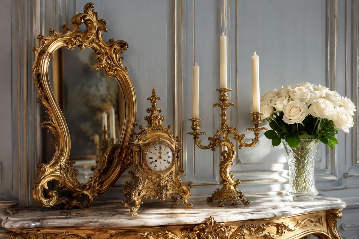
What Counts as Rococo Decor?
Rococo decorative objects fall into several categories, all defined by the broader Rococo aesthetic: lightness, organic ornament, pale palette, gilded accents, and an emphasis on elegance over authority.
Key Rococo decor categories:
- Ornate framed mirrors and picture frames (gilded or carved wood)
- Pale-glazed ceramics and porcelain (European and Chinese-influenced)
- Candelabra, girandoles, and candlestick holders in gilded bronze or similar metalwork
- Ormolu-mounted objects (vases, clock cases, boxes with gilded bronze mounts)
- Textile-based decor (embroidered cushions, silk or damask decorative pillows, draped fabrics)
- Gilded or brass accent objects (small boxes, decorative trays, picture frames)
- Natural organic elements (branches, dried botanicals, shell forms used sparingly)
What does not fit Rococo decor:
- Heavy dark objects (dark wood, black metal, dense stone)
- Highly geometric, abstract, or industrial objects
- Figurative sculptures with narrative content (mythological scenes, religious figures used as accent objects — these belong to a more academic Baroque or Neoclassical context)
Note on chinoiserie: Chinese porcelain, lacquered objects, and chinoiserie-patterned pieces are historically consistent with Rococo interiors. The 18th century saw significant import of Chinese goods to Europe, and their integration into Rococo schemes was deliberate and fashionable.
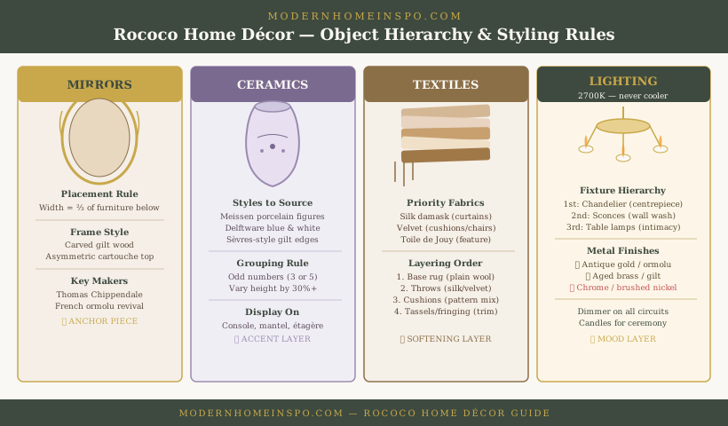
Mirrors and Frames
Ornate Mirrors
The ornate framed mirror is the single most effective and most versatile Rococo decor object. It functions simultaneously as a practical object (reflecting light and space), a decorative statement (the frame is the artistic element), and a structural anchor for a room composition (above a fireplace, above a console, above a dresser).
For detailed guidance on Rococo mirrors specifically, see Rococo mirror ideas.
In the context of Rococo home decor broadly:
Use one large mirror rather than several small ones. A large ornate mirror has architectural scale and reads as a design decision. Multiple small ornate mirrors on the same wall read as decoration rather than design.
Frame finishes:
- Gilded (gold leaf or quality gilding): the most historically authentic and the most formal
- Partially gilded (carved wood with gilded detail): more versatile, works in casual rooms
- Painted (white or pale gray with gilded detail): appropriate for bedrooms and informal rooms
- Burnished antique gold (aged gilding with visible variation): the most contemporary version of authentic gilding
Picture and Display Frames
Ornate gilded picture frames — in the same vocabulary as Rococo mirror frames — carry Rococo character to art, prints, and photographs. A framed print with an ornate gilded frame on a plain wall is a low-investment Rococo reference.
Using ornate picture frames effectively:
- Use them for art or prints that can carry the weight of an ornate frame — detailed engravings, architectural drawings, botanical illustrations, landscape prints
- Group several ornate frames in a gallery wall arrangement if using multiple (matched frames in the same gilded finish read as a considered collection; mismatched ornate frames read as disorganized)
- Do not use ornate frames for modern digital photography — the juxtaposition is typically too jarring
Ceramics and Vases
Ceramics were central to Rococo interior decoration. European porcelain manufacturers — Meissen in Germany, Sèvres in France, Chelsea and Bow in England — were established in the 18th century specifically to meet aristocratic demand for luxury tableware and decorative porcelain.
Pale-Glazed European-Style Ceramics
For contemporary Rococo decor, pale-glazed ceramics — in white, cream, celadon, pale blue, or soft rose — carry the character of period European porcelain in a usable, practical form.
What to look for:
- Smooth, pale glaze in a muted tone (not bright high-gloss white, not raw stoneware)
- Subtle surface texture or pattern — delicate floral, organic, or geometric motifs rather than bold graphic patterns
- Vessel forms that are curved and slightly organic (amphora-like forms, rounded belly vases, curved bowl forms) rather than straight-sided cylinders
Placement: One large pale ceramic vase as a focal point on a console, mantel, or sideboard. Two or three smaller pieces as a group (varying heights, similar palette) on a shelf or coffee table.
Chinese Blue-and-White Porcelain
Blue-and-white Chinese porcelain was one of the most fashionable objects in 18th-century European Rococo interiors — imported in large quantities and displayed prominently. Contemporary blue-and-white porcelain (Chinese export ware, or European equivalents like Delft) is historically consistent with Rococo decor and works well in Rococo-influenced rooms.
Use: A single large blue-and-white vase or jar as a statement object on a console or floor-standing position. A pair of smaller blue-and-white pieces flanking a mantel mirror. Blue-and-white works best in rooms where the wall color is warm cream or off-white — it can fight sage green or heavily warm-toned palettes.
Porcelain Figurines
Period Rococo decor included porcelain figurines — Meissen shepherdess figures, pastoral scenes, and similar objects. In a contemporary room, porcelain figurines are the most difficult Rococo decor object to use without looking dated or themed.
If using: limit to one significant piece — a large sculptural form rather than multiple small figurines. Position it as a standalone focal point, not as one element in a cluster of small objects.
Candelabra, Candlesticks, and Lamps
Light was a central element of Rococo interior design. Rococo interiors were specifically designed for candlelight — the warm, flickering, multi-point light of candelabra and wall sconces that made gilded surfaces shimmer and pale walls glow.
Candelabra
Multi-armed candelabra — bronze, gilded brass, or silver — are the most directly Rococo lighting object. They appear on mantel shelves, console tables, dining tables, and as freestanding floor-height pieces (torchères).
For contemporary use:
- A pair of matching candelabra on a mantel shelf, flanking a central object, creates the formal Rococo mantel composition
- Burnished brass or antique gold finish is most appropriate; avoid bright chrome or steel
- Real candles are preferable to battery-operated candles for the light quality they produce; LED candles are acceptable in rooms where open flames are a concern
Candlesticks
Individual candlesticks in gilded brass, silver, or ceramic with gold detailing are simpler-to-use Rococo accent objects. A pair of matching candlesticks on a dining table, side table, or console adds Rococo material quality without requiring the formal arrangement of full candelabra.
Height variation: Using candlesticks of different heights in a grouped arrangement creates more visual interest than a perfectly matched pair at the same height. One taller, one shorter, same material and finish.
Table Lamps
Table lamps with ornate or detailed bases — ceramic, carved wood, metallic with surface texture — carry Rococo decorative character at the scale of functional lighting. A lamp base in a Rococo-consistent material (pale-glazed ceramic, gilded or muted brass metal) with a linen or fabric shade in a warm neutral tone is both functional and decorative.
Note: Lamp shades in Rococo-consistent rooms should be in cream, warm white, or pale ivory — not bright white (too harsh) and not heavily patterned (competes with the decorative base).
Textiles as Decorative Objects
Rococo interiors were textile-rich — brocades, damasks, silk tapestries, embroidered chair covers, and layered bed dressings. In a contemporary room, textiles used as decor objects carry this quality without requiring period reproduction fabrics.
Cushions
Decorative cushions on sofas and chairs in Rococo-consistent fabrics and tones:
Appropriate fabrics: Velvet (in muted dusty tones — sage, blush, warm gold), woven damask or jacquard (in pale or muted pattern), embroidered linen (floral or organic motif embroidery in tone-on-tone or one-color-on-neutral).
Quantity: Three to five cushions on a sofa — not as many as possible, but enough to suggest layered comfort. A single oversized cushion on each side and one or two accent cushions in the center is a common effective arrangement.
Throws
A throw draped over the arm or back of a sofa adds casual elegance. For Rococo character:
- Cashmere, mohair, or velvet throw in pale gold, warm ivory, or soft blush
- Draped naturally (not folded with military precision) — thrown across an arm or folded loosely at the foot of the sofa
Decorative Textile Accessories
Decorative boxes upholstered in silk or damask, a small textile-covered screen, or a decorative pillow on an accent chair in period-consistent fabric add Rococo textile richness at small scale.
Gilded and Brass Accents
Gilded bronze (ormolu) was the metalwork of Rococo interiors — appearing on furniture mounts, clock cases, candelabra, and decorative objects. In contemporary decor, muted brass and burnished gold serve the same function.
Decorative Trays
A gilded or muted brass tray on a coffee table or console creates a contained surface for grouping smaller objects — a candle, a small ceramic piece, a book. The tray frames the objects and prevents them from looking scattered.
Picture and Mirror Frames
See the mirrors and frames section above.
Hardware and Fixtures
Muted brass or burnished gold hardware on furniture (drawer pulls, knobs) and fixtures (door handles, towel rings in bathrooms) is the most pervasive and cost-effective way to introduce Rococo material quality throughout a home. It is not a decorative object in the conventional sense, but its cumulative effect on the atmosphere of a room is significant.
Small Gilded Accent Objects
A small gilded box on a console, a brass letter opener on a desk, a gilded picture frame on a shelf — these small gilded accent objects accumulate to create the material warmth of a Rococo room without any single large investment.
Proportion: The ratio of gilded accents to other surfaces should be relatively small — gilded objects against a large background of pale, plain surfaces. The contrast makes the gilding legible; too many gilded objects and the quality of each individual piece becomes invisible.
Styling Principles
The Rule of One Large and Two Small
In any given vignette (a console, a mantel, a shelf), the most readable Rococo composition uses one large statement object and two smaller accent objects. The large object provides the focal point; the small objects provide context and visual completion.
Example: Ornate mirror (large, architectural) → one ceramic vase (medium, organic form) → two candlesticks (small, symmetrical flanking).
The objects should be in the same palette but different materials — different textures, finishes, and forms prevent the grouping from reading as a bought set.
Height Variation
Effective object groupings use elements at different heights. A vase, a candlestick, and a small ceramic box on the same surface work better if they are at clearly different heights — creating a varied silhouette rather than a flat horizontal line.
Odd Numbers
Groups of three or five objects read more dynamically than groups of two or four (which read as pairs). The odd number creates visual interest without requiring the precision of mirror-image symmetry.
Space Between Objects
Objects need space around them to be legible. Crowding many objects together creates visual clutter in which no individual piece can be appreciated. Leave deliberate space — at least a few inches — between objects in a grouping, and leave clear space on the surface around the grouping.
Design Tip
Editing is the hardest styling skill. Most styled surfaces look better with fewer objects than more. After arranging a grouping, remove one object and observe whether the composition improves. It often does. The objects that remain read more clearly when they have more space.
What to Avoid
Cherubs, putti, and figurative religious objects as accent pieces. In a historical context, these had specific iconographic meaning within a complete interior program. In a contemporary room, a cherub lamp base or a Madonna figurine on a console reads as decoration overload — too referential without context.
Matching sets of small ornate objects. A matching set of five ornate gilded objects in the same style, finish, and proportional family reads as a bought collection rather than a curated room. Mix materials, scales, and sources.
Bright gold where burnished gold is needed. High-gloss, bright gold paint on any object looks cheap in most domestic contexts. Burnished, antiqued, or matte-finished gold — including proper gold leaf or quality plating — reads as sophisticated.
Too many objects on every surface. Every surface fully loaded with decorative objects is one of the most common home styling mistakes. A console with seven objects, a mantel with six, and a coffee table with eight reads as a home that collects objects rather than a home that is designed. Edit to two or three objects per surface maximum.
Objects without any stylistic coherence. A Rococo gilded mirror beside a Scandi raw wood candle holder beside a graphic modern print in a black frame beside a terracotta pot is an incoherent assembly. The objects do not need to be from the same period, but they need to share palette, material quality, or stylistic sensibility to read as a composed room rather than accumulated possessions.
Frequently Asked Questions
- What are typical Rococo decorative objects?
- Typical Rococo decorative objects include ornate gilded mirrors, carved picture frames, pale-glazed porcelain and ceramics (including Chinese and European porcelain that was fashionable in the 18th century), candelabra and candlesticks in gilded or ormolu bronze, ormolu-mounted vases and clocks, and textile-covered decorative boxes and screens.
- How do I make my home look Rococo without it looking overdone?
- Limit Rococo decor objects to two or three per room — one large statement piece (an ornate mirror, a significant ceramic) and one or two accent pieces (a pair of candlesticks, a gilded frame). Keep the surrounding room neutral and restrained. Objects with heavy ornament need clean space around them to read correctly.
- What is ormolu and how is it used in Rococo decor?
- Ormolu is a gilded bronze used for decorative mounts on furniture and objects. In Rococo design, ormolu appears as mounts on commodes and cabinets (handles, corner mounts, feet), as the structure of candelabra and girandoles, and as decorative mounts on clock cases and vases. In contemporary Rococo-influenced decor, muted brass or burnished gold metalwork plays the same role.
- Is chinoiserie Rococo?
- Chinoiserie — European decorative arts using Chinese-inspired motifs and patterns — was an integral part of the Rococo period. Chinese lacquerware, porcelain, and silk were imported to Europe throughout the 18th century, and European craftsmen produced chinoiserie-style pieces that mixed Chinese-inspired motifs with Rococo ornamental vocabulary. Blue-and-white Chinese porcelain, lacquered panels, and chinoiserie wallpaper are all historically consistent with Rococo interiors.