Accent Wall Ideas: Which Wall to Choose, What Colour Works, and When to Skip It
Quick Answer
An accent wall works when it coincides with an architectural focal point — the wall behind the bed, the chimney breast wall, the end wall of a hallway, or the wall that frames the main seating in a living room. The accent colour should be 2–3 tones deeper than the surrounding walls, in the same undertone family (warm deep sage against warm cream, not cool navy against warm greige). An accent wall fails when there is no architectural reason for that wall to be different — a random side wall in a plain rectangular room just creates a colour interruption with no visual logic.
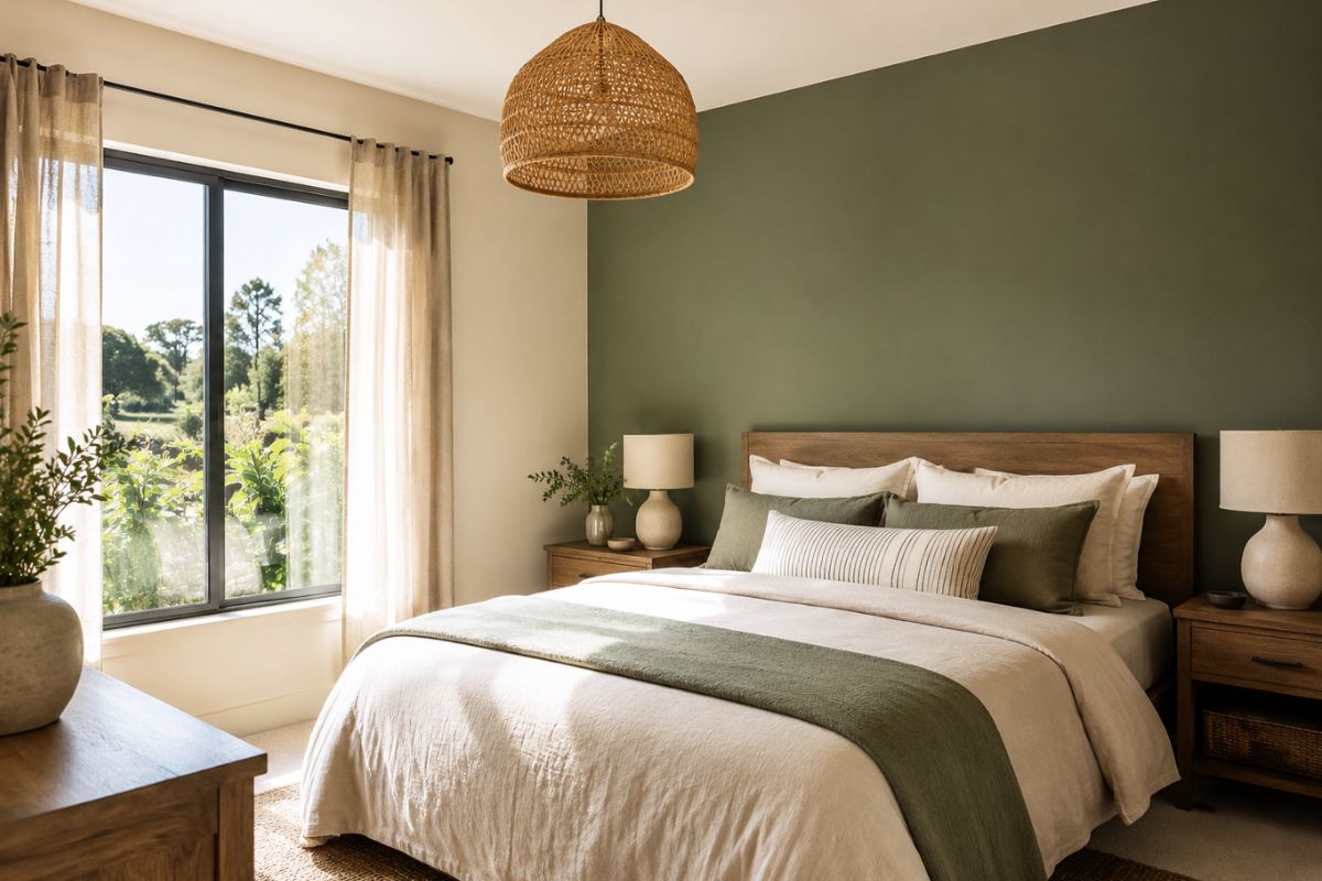
The accent wall is one of the most misused techniques in interior design. When it works — a deep sage behind a bed, a terracotta-painted chimney breast in a cream living room, a dark forest green end wall in a hallway — it gives a room structure, depth, and a clear focal point. When it fails — a random side wall painted a bold colour in a plain rectangular room — it creates a visual interruption with no architectural justification and no clear function.
The difference between these two outcomes is not the colour. It is whether the wall chosen has a reason to be different from the others.
When Accent Walls Work
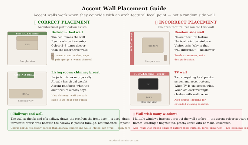
An accent wall works when it does one of the following:
Reinforces an existing architectural focal point. A chimney breast is already the dominant feature of a living room — it projects into the room, has physical presence, and is the natural place the eye rests. Painting it a deeper or different colour reinforces what the architecture already says. A wall without a fireplace, alcove, or structural distinction has no inherent reason to be featured.
Creates visual depth in a specific direction. Painting the end wall of a hallway a deeper colour draws the eye toward it, creating an impression of depth and intentional progression through the house. The same depth effect works at the far end of a rectangular room — it creates the sense of a destination.
Frames the primary furniture piece. The wall behind a bed is not arbitrarily different — it frames the headboard and creates a backdrop for the room’s main furniture piece. This reads as deliberate and structured rather than random.
Defines a zone in an open-plan space. In a kitchen-dining-living open plan, an accent wall behind the dining table or at the kitchen end can define the zone without physical partition.
Which Wall to Choose
The wall the eye goes to first when entering the room. This is not always the largest wall or the longest wall — it is the wall that sits at the natural endpoint of the sightline from the entrance. Stand in the doorway and note where your eyes land. That is the accent wall candidate.
Behind the primary furniture piece. The bed in a bedroom. The sofa or fireplace in a living room. The dining table in a dining room. These pieces already anchor the room — the wall behind them benefits from differentiation.
The alcove or chimney breast wall. Any wall with a projecting or recessing architectural element already has visual weight — the accent treatment emphasises and clarifies what’s already there.
The end wall in a narrow room or hallway. The wall at the far end of a long narrow space benefits from a deeper treatment: it draws the eye forward and creates a perceived shortening of the excessive length.
Which Wall to Avoid
A random side wall in a plain rectangular room. A flat, undistinguished side wall with no architectural feature painted a different colour reads as an error rather than a decision. The question a visitor subconsciously asks is “why is that wall different?” — if there is no architectural answer, the accent wall has failed.
The TV wall. A wall housing a television as the accent wall creates two competing focal points: the wall colour and the screen. The screen will always win visually when on; when off, the wall colour clashes with the dark rectangle of the TV. Accent walls and TV walls should be separated.
The wall with the most windows. A wall interrupted by multiple windows loses most of its surface area to glass — the accent colour appears only in the narrow sections between windows and above the window openings, creating a fragmented, patchy effect.
Adjacent to a strong pattern. An accent wall immediately adjacent to heavily patterned curtains, a bold wallpaper panel, or a large-format patterned rug competes rather than complements. Each element fights for the eye’s attention.
Colour Depth and Undertone Rules
The depth formula: 2–3 tones deeper than surrounding walls.
An accent wall that is only slightly different from the surrounding walls reads as an error — as if a second coat of paint wasn’t applied, or a different batch of paint was used. The colour needs to be clearly, deliberately different.
Two to three tones deeper in the same colour family is the practical guideline. If the room is painted in a pale sage (Farrow & Ball Mizzle), the accent wall might be a deeper sage (F&B Calke Green or Cromarty) or move toward a deep warm teal (F&B Green Smoke). If the room is warm cream (F&B All White), the accent might be deep warm greige (F&B Elephant’s Breath) or deep sage (F&B Mizzle).
The undertone must match.
An accent wall in a warm room must use a warm-undertone accent colour. Warm cream walls + cool navy accent = undertone conflict. The navy reads as jarring and cold against the warm cream; the cream reads as slightly yellow against the cool navy.
Warm room + warm accent colour that is simply deeper: always reads as deliberate and harmonious.
Saturation: muted is better than vivid.
Vivid, fully saturated accent colours (signal red, cobalt blue, bright yellow) overwhelm most residential rooms. Muted, complex versions of the same colour — dusty terracotta rather than orange-red, muted dusty navy rather than cobalt, warm sage rather than lime green — read as sophisticated rather than bold. The eye rests on a muted wall; it bounces off a vivid one.
Specific accent colour pairings:
| Surrounding Wall | Accent Wall Options |
|---|---|
| Warm cream / off-white | Deep warm sage, warm charcoal, deep terracotta, deep warm taupe |
| Pale warm greige | Warm deep sage, deep dusty blue-grey (warm-leaning), dark warm charcoal |
| Pale sage green | Deeper sage, forest green, warm dark olive |
| Warm white + wood floors | Deep warm navy (with warm undertone), deep forest green, warm dark charcoal |
| Cool grey | Crisp deep grey-blue, dark cool charcoal, deep cool navy |
Beyond Paint: Other Accent Materials
Paint is the most common accent wall treatment but not the only effective one. In some rooms, a material treatment creates more character than any colour.
Wallpaper. A single wall in a botanical print, a geometric pattern, or a textured grass cloth creates more visual interest than a flat paint colour. Best behind the bed in a bedroom or as the chimney breast treatment in a living room. Requirements: the pattern scale should suit the room — a large-scale tropical print in a small bedroom overwhelms; a fine geometric works at any scale.
Vertical timber panelling. Reeded or fluted timber boards on the bed wall or chimney breast add depth, shadow lines, and material warmth that paint cannot replicate. Works in contemporary schemes and has the practical advantage of covering imperfect plaster. Can be painted in the accent colour for a combined texture-and-colour effect.
Board-and-batten or shiplap. Horizontal boards create a texture break that works in coastal, farmhouse, and cottage schemes. The depth between boards creates shadow lines that add dimension. Usually painted rather than left as bare timber.
Limewash. A brushed, textured limewash paint application creates a mottled, naturally varied surface with visible brush marks and material depth. Reads as artisanal and Italian-inspired — well suited to Mediterranean, rustic, and maximalist schemes. Brands: Kalk, Edward Bulmer, Lick Limewash.
Zellige or encaustic tile. A kitchen or bathroom wall in zellige tile (Moroccan hand-glazed, with natural surface variation) is an accent wall in a material rather than just a colour. The reflective variation and craft quality of zellige creates depth and interest that a flat paint colour cannot match.
Room-by-Room Accent Wall Guide
Bedroom — behind the bed, always.
The bed wall is the correct and only accent wall in most bedrooms. It frames the headboard, creates depth when you lie in bed looking toward it, and photographs well. The accent should be noticeably deeper than the other three walls — muted but clearly different. Popular combinations: warm cream three walls + deep warm sage bed wall; pale greige three walls + deep warm taupe or charcoal bed wall.
Avoid accent walls on the wall with the window (fragments the light) or opposite the bed (you look at it constantly from bed — overwhelming in a deep colour).
Living room — chimney breast or sofa wall.
The chimney breast is architecturally self-justifying as an accent wall — it already projects into the room. If there is no chimney breast, the wall behind the main sofa or the wall that the sofa faces is the accent candidate. In open-plan living rooms, the accent wall can define the living zone within the larger space.
Avoid: the TV wall. The screen creates a focal point that competes with the accent colour, and a dark wall behind a screen creates a contrast ratio that is visually fatiguing in extended viewing.
Hallway — the end wall.
The wall at the far end of a hallway draws the eye from the front door and benefits from a deeper or different colour. This creates visual interest in an otherwise functional space and creates a sense of arrival. A dark, dramatic colour (deep warm charcoal, deep forest green, terracotta) works particularly well in hallways because the hallway is passed through rather than inhabited — the impact is brief and intentional.
Dining room — behind the table or any wall.
Dining rooms are less architecturally constrained than other rooms — no TV, no obvious window-wall problem, no dominant single piece of furniture. Any wall can work as the accent wall in a dining room if the furniture is positioned in relation to it. The wall behind where guests sit (opposite the host) or behind a sideboard or artwork grouping is the most common choice.
Home office — behind the desk/screen.
The wall behind the desk appears in every video call — it is effectively a branded backdrop. An accent wall here is a practical as well as aesthetic decision. A deep, warm, calm colour (warm sage, warm terracotta, dark warm neutral) reads well on video without the reflectance issues of white. Avoid bright whites or very light walls as desk backdrops — they cause the camera to expose for the bright background, underexposing the face.
Bathroom — the wet zone wall.
The wall at the back of the shower or behind the bath is already architecturally defined as a different zone. Treating it with a distinct tile material, a deeper tone, or a different pattern reinforces the zone and creates visual interest. This is the most architecturally justified accent wall in any room — the wet zone is already separated by function.
How Many Accent Walls
One per room. Two accent walls in the same room create competing focal points. The eye doesn’t know where to settle. Two adjacent accent walls can also create an awkward junction where the two different colours meet at a corner — this requires careful management and rarely looks as intended.
Never adjacent rooms sharing the same accent colour. Two connected rooms — living room and hallway, bedroom and en suite — each with the same deep accent colour creates repetition that makes the accent feel less deliberate. The accent effect depends on contrast with surrounding neutrals. Use in one room; let the adjacent rooms remain neutral.
The exception: an entire room as the accent. One deeply coloured room within a neutral home — a terracotta dining room, a dark charcoal study, a forest green snug — is a whole-room application of the accent wall principle. This works when the room is self-contained and entered from a neutral adjacent space. The transition from neutral hallway into a dramatically coloured room is the accent effect at full scale.
Frequently Asked Questions
- Which wall should be the accent wall in a living room?
- The wall behind or adjacent to the main seating group — not the TV wall. The accent wall should be the one that a person sitting in the main seat looks toward, or the chimney breast wall which already has architectural emphasis. The TV wall is a poor accent wall choice because it competes with the screen and creates a distracting background for video calls and gatherings.
- What colour should an accent wall be?
- 2–3 tones deeper than the surrounding walls, in the same undertone family. If the surrounding walls are warm cream (F&B All White), the accent might be deep warm sage (F&B Mizzle), warm taupe (F&B Mouse's Back), or warm charcoal (F&B Railings). The undertone must match — a cool navy accent against warm cream walls creates an undertone conflict that makes both colours look wrong.
- Can you do an accent wall in a small room?
- Yes, specifically the end wall or the wall that the eye travels to first. In a small bedroom, the wall behind the bed is the correct accent wall — it creates depth and draws the eye to the focal point. Avoid accent walls on the side walls of a narrow room, which makes the room feel even narrower. The key is depth of colour, not darkness: a deep, rich warm white (F&B Pointing vs surrounding F&B All White) reads as an accent in a subtle but effective way in very small rooms.
- Is an accent wall outdated?
- The badly executed accent wall — a random side wall in a rectangular room painted a bright, contrasting colour with no architectural logic — has a dated quality. A well-placed accent wall coinciding with an architectural feature (chimney breast, alcove, bed wall, hallway end wall) is a permanent and practical design tool. The trend evolved from poorly placed, overly saturated accent walls to architecturally grounded, tonally sophisticated feature walls.