Neutral Tone Living Room Ideas That Feel Warm, Not Bland
Quick Answer
A neutral living room feels warm and finished when you use warm-undertone neutrals (greige, warm cream, soft taupe) rather than cool grays, layer different textures (linen, wool, wood, jute) within the neutral palette, size the rug correctly (front legs of sofa on the rug), and use 2700K warm white lighting rather than bright white overhead light.
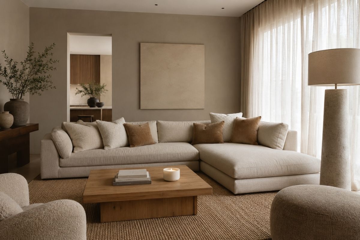
The most common neutral living room problem is not the color choice — it is the execution. A well-executed neutral living room feels calm, warm, and considered. A poorly executed one feels like a beige rental apartment that no one has done anything with.
The difference is almost always in a few specific decisions: undertone, texture layering, rug sizing, and lighting. Get these right and a neutral living room looks intentional and warm. Get them wrong and it looks unfinished regardless of how much money you spent on furniture.
Choosing the Right Neutral
Before choosing wall color, sofa color, or any other element, you need to understand the undertone direction of your room’s light.
Warm light = use warm neutrals. If your living room faces south or west, or you use warm amber LED bulbs (2700K), your lighting adds warmth to whatever is on the walls. You have more flexibility here — you can use slightly cooler neutrals without them reading cold.
Cool or limited light = use warm neutrals. If your room faces north or east, or has limited windows, always go warmer with your neutrals. A cool gray in a north-facing room reads blue and cold. A warm greige in the same room reads calm and neutral.
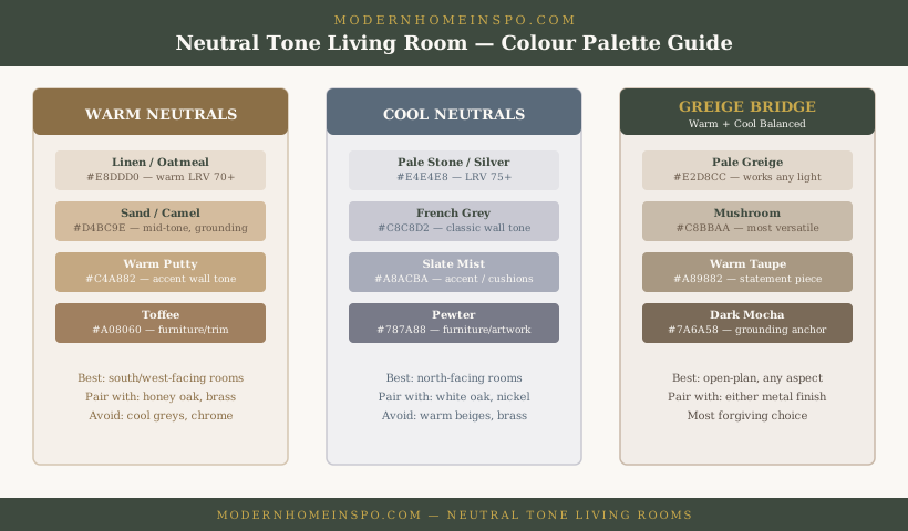
Neutral wall colors to consider, with representative paint options and LRV (Light Reflectance Value — higher = lighter):
| Tone | Representative Paints | LRV Range | Best for |
|---|---|---|---|
| Warm greige | Farrow & Ball Elephant’s Breath, Benjamin Moore Revere Pewter, Dulux Natural Hessian | 43–52 | Most living rooms — versatile in all light conditions |
| Warm cream / off-white | Farrow & Ball Pointing, Dulux Timeless, Farrow & Ball Wimborne White | 72–80 | Bright rooms with good natural light; smaller rooms |
| Soft taupe | Farrow & Ball Dead Salmon, Dulux Polished Pebble, Benjamin Moore Pale Oak | 45–65 | Larger rooms, rooms with warm wood floors |
| Pale greige | Little Greene Sandstone, Benjamin Moore Pale Oak OC-20, Sherwin-Williams Accessible Beige | 55–65 | North-facing rooms that need warmth without going dark |
| Warm gray (limited use) | Farrow & Ball Purbeck Stone, Little Greene French Grey Pale | 50–58 | South-facing rooms only — reads blue-cold in low light |
LRV guidance for living rooms: Rooms with a sofa and full furniture read darker than empty rooms — the upholstery absorbs light. For a living room that won’t feel like a dark box, target LRV 50+ for the dominant wall tone unless you have large windows or a south-facing orientation.
Important
Test any neutral wall color as a large painted sample — at least 12 inches square — on the actual wall before buying a full can. Observe it at different times of day and under your actual artificial lighting. Paint chips under store lighting are unreliable.
Layering Texture in a Neutral Room
In a room without color contrast, texture contrast is what creates visual interest. A neutral living room that uses only one or two textures looks flat and bland. A neutral living room with four or five different textures looks rich and deliberate.
Target textures:
- Linen sofa fabric: Soft but structured, catches light differently than cotton or microfiber. The slight natural variation in linen weave adds visual depth.
- Jute or sisal rug: A coarser, rougher texture that anchors the room and contrasts with softer upholstery.
- Wool cushions or throw: A denser, warmer texture. A chunky knit throw adds considerable textural contrast with minimal cost.
- Warm wood: Any wood surface — coffee table, side table, shelving — adds grain, natural variation, and warmth.
- Ceramic or stone: A ceramic lamp base, a concrete tray, a stone coaster — materials with visible texture that catch light.
The key is contrast within the neutral palette. You are not adding color — you are adding texture. Every surface should look and feel different from the surface next to it.
Rug Sizing and Placement
Wrong rug sizing is one of the most common and most visually damaging mistakes in living room design.
The rule: The front legs of the sofa and all seating chairs should rest on the rug. The rug should extend at least 12–18 inches in front of the sofa. A rug that sits entirely under the coffee table — with all sofa legs floating on bare floor — makes the room feel disconnected, smaller, and unfinished.
For living room rug sizes, the front-legs-on rule is the baseline — but the full sizing logic by room dimension, metric/imperial, and layering options is covered in detail in Layering Rugs in Living Rooms. The painter’s-tape method before buying is strongly recommended: mark the rug dimensions on the floor and live with it for a day before committing.
Rug color in a neutral living room:
Choose a rug that is a tone or two darker or lighter than the walls and sofa, not the same value. A cream sofa on a cream rug against cream walls reads as one undifferentiated mass. Add contrast: cream sofa, natural jute rug, warm greige walls.
For visual interest without adding color: a neutral rug with a subtle geometric or organic pattern in two tones of the same neutral palette (warm gray and cream, two shades of beige) adds structure without disrupting the neutral scheme.
Lighting a Neutral Living Room
Lighting is the most important variable in whether a neutral living room feels warm or cold in the evening — and it is completely independent of how well you chose the wall colour or textiles.
The specific lighting problem in neutral rooms: warm-undertone neutrals painted under cool or bright-white artificial light read as gray, flat, and cold. The same paint under 2700K warm white reads as it should — warm, considered, intentional. The paint has not changed; the light has.
The critical rule: Replace any cool white, daylight, or neutral white bulbs (3000K+) with warm white 2700K LED throughout the room. This is the single highest-impact change available to a neutral living room at any budget.
Beyond bulb temperature, a neutral living room needs multiple light sources rather than a single overhead circuit — the three-layer ambient/task/accent approach, specific fixture choices for neutral rooms, and dimmer integration are covered in detail at Ambient Lighting Ideas for Living Rooms.
Neutral-specific lighting notes:
- A warm-toned lamp shade (linen, cream, or warm paper) reinforces the neutral palette; a white or cool-grey shade fights it
- Under-shelf or cabinet lighting in a neutral living room extends the warm glow to vertical surfaces — effective in alcoves
- Picture lighting above artwork uses the neutral wall as a frame and adds depth without competing with the palette
Furniture for a Neutral Living Room
In a neutral living room, furniture shape and material matter more than furniture color.
Sofa: A sofa in natural linen, warm beige, or warm cream fabric anchors the neutral palette. Avoid a sofa in the exact same tone as the walls — add a step of contrast. If walls are warm greige, choose a cream or natural linen sofa. If walls are warm cream, a greige or taupe sofa adds grounding contrast.
Sofa form: a sofa with clean lines and low arms reads more contemporary. A sofa with slightly curved arms and a tufted back reads warmer and more traditional. In a neutral room, a sofa with curved detailing softens the palette without adding pattern or color.
Coffee table: Warm wood is the most versatile choice. A round or oval coffee table with a wood top softens the geometry of the room and adds natural warmth. Avoid all-glass coffee tables in a neutral room — they tend to make the room feel sparse rather than minimal.
Side tables: Use the same warm wood, or mix in a ceramic or stone side table for texture contrast.
Shelving and storage: Keep shelving in a finish that complements the walls — white or off-white painted for warm cream rooms; natural oak or walnut for greige rooms. Avoid heavy dark wood shelving that creates too much contrast in a light neutral room.
When to Add Accent Colors
A neutral living room works best with one or two carefully chosen accent tones, not multiple.
Accent pairings by base neutral:
| Base neutral | Works with | Avoid |
|---|---|---|
| Warm greige (e.g. Elephant’s Breath) | Dusty sage, terracotta, warm charcoal, muted rust | Cool navy, lavender, saturated green |
| Warm cream / off-white | Dusty blue, sage green, caramel, warm black | Cool gray, lilac, teal |
| Soft taupe | Rust, ochre, warm olive, dark walnut | Cool blue-gray, white, primary colours |
| Pale greige | One deep tone (forest green or charcoal) as sole accent | Multiple competing accent colours |
Where to add accent:
- Cushions: two or three cushions in one accent color on the sofa
- A single throw in the accent tone or a natural texture
- A ceramic vase or decorative object on the coffee table
- One piece of wall art that uses the accent as a dominant tone in its palette
Quantity rule: One accent color in two or three objects reads as a deliberate design decision. Two accent colors in four objects reads as accidental accumulation. A neutral room with rust cushions, a rust ceramic vase, and a rust-toned artwork is specific and considered. The same room with rust, sage, navy, and ochre distributed randomly looks like it was furnished across several shopping trips with no plan.
Common Problems and Fixes
Problem: The room looks gray and cold. Fix: The neutral has a cool undertone. Repaint with a warmer greige or cream. Change all bulbs to 2700K warm white.
Problem: The room looks beige and boring. Fix: Add texture contrast (jute rug, linen cushions, rough ceramic). Add one muted accent color. Check that the rug is sized correctly and that you have more than one light source.
Problem: The room feels unfinished even though all the furniture is there. Fix: Almost always a rug that is too small. The rug should anchor the seating group, not just sit under the coffee table. Size up.
Problem: The sofa looks dirty next to the walls. Fix: The wall and sofa tones are too close and fighting. Add contrast: if the wall is warm cream, a greige or taupe sofa separates more clearly. Or add texture contrast so the eye sees fabric texture before it sees tonal proximity.
Problem: The room looks bright during the day but cold and harsh at night. Fix: Add warm light sources other than the ceiling light. A floor lamp and one or two table lamps. Set all to 2700K. Use the ceiling light on a dimmer and turn it down in the evening.
Frequently Asked Questions
- Why does my neutral living room look gray and cold?
- Most likely the neutral you chose has a cool undertone (blue, green, or purple). Cool-undertone neutrals look gray and cold under warm artificial lighting. Switch to a warm-undertone neutral (greige, warm beige, warm cream) and use 2700K warm white bulbs rather than daylight or cool white bulbs.
- What sofa color works best in a neutral living room?
- For warm neutral walls, the best sofa colors are natural linen, warm cream, warm beige, or taupe. A medium gray sofa also works if the gray is warm (slightly beige). Avoid cool blue-gray sofas against warm neutral walls — the contrast reads discordant rather than intentional.
- What rug size should I use in a neutral living room?
- For a standard living room, an 8x10 foot rug is the most common appropriate size. The front legs of all seating furniture should rest on the rug. A rug that only sits under the coffee table, with sofa legs floating on bare floor, makes the room feel disconnected and smaller.
- Can I add color to a neutral living room?
- Yes, through carefully chosen accents. The best approach is one or two muted accent tones — dusty green, rust, soft terracotta, muted navy — rather than multiple bright colors. Keep the quantity small: a few cushions, a vase, a piece of wall art. The neutral backdrop makes even small accents noticeable.