How to Choose Interior Paint Colours: The System That Avoids Expensive Mistakes
Quick Answer
The system for choosing interior paint colours: (1) Identify undertone first — every paint has one (warm/cool/neutral), and it must work with your fixed elements (floor, furniture); (2) Test in situ — paint A3 samples on the actual wall and observe morning, afternoon, evening, and overcast; (3) Check the light direction — north-facing rooms need warmer colours; south-facing can handle cooler ones; (4) Choose finish after colour — flat/matt for walls, eggshell for woodwork, silk or satin for kitchens and bathrooms; (5) One decision at a time — wall colour first, then ceiling, then trim.

Choosing paint colours is one of the decisions that looks simple and turns out to be genuinely complicated. The colour you’ve selected from a chip at the shop, from a brochure, from someone else’s Instagram, or from a rendering on a paint manufacturer’s website is almost always different from what appears on your actual wall in your actual room.
The reason is that paint colour is not an intrinsic property of the paint — it’s a product of the paint’s pigment interacting with the light in a specific room, against specific adjacent surfaces. The same paint applied to a south-facing room and a north-facing room looks like two different colours.
The system below is designed to prevent expensive paint mistakes.
Understanding Undertones
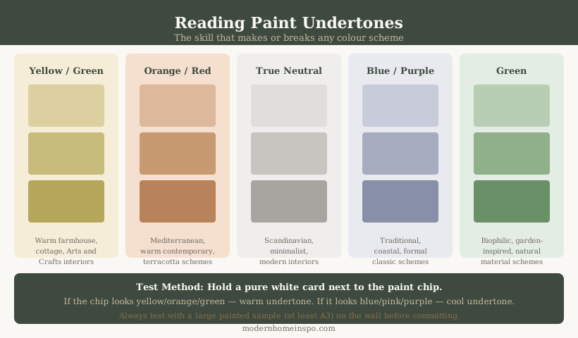
What an undertone is
Every paint colour — including whites, greys, and neutrals — contains a secondary colour impression beneath the primary one. This is the undertone. A grey wall that looked blue in the showroom has a blue undertone. A white that reads as yellow-cream in your room has a warm (yellow or pink) undertone.
Undertones only become visible when they interact with the light in a specific room, when placed next to other colours, or when compared to a neutral white. They are invisible on a small chip against the chip-board background in a paint shop, which is why paint samples behave differently in the room.
The three undertone families
Warm undertones contain yellow, orange, red, or pink. These read as inviting, comfortable, and earthy. They work well in rooms with cool (north-facing) light because they counteract the coolness.
Cool undertones contain blue, purple, or green. These read as calm, fresh, and airy. They work in rooms with warm (south-facing) light without creating a heavy atmosphere.
Neutral undertones are balanced — neither distinctly warm nor distinctly cool. True neutrals are rare; most “neutral” colours have a subtle lean in one direction.
Testing for undertone
Hold the paint chip against a pure white card. The contrast will reveal the undertone — a warm white will look cream or blush against pure white; a cool white will look blue-grey or purple-tinged. For a wall colour: place the chip against a pure white surface in the room (ceiling or a white piece of paper) and squint. The remaining impression is the undertone.
Matching undertones to fixed elements
The floor is the dominant fixed element in most rooms — particularly with timber or stone floors. A warm oak floor (yellow-brown undertone) works better with warm-toned walls (yellow, orange, red undertone) than with cool walls (blue-grey), which will fight the floor’s warmth. Identify the undertone of your floor and your furniture before selecting wall colour.
Testing Paint In Situ
The only reliable method
Paint large samples (A3 minimum — ideally 60×60cm) of shortlisted colours directly on the actual wall. Not on a piece of board that you move around. Not a small chip. The wall itself, in the position where the colour will live.
Observe the samples at:
- Morning light (before 10am) — the light colour and angle changes dramatically from morning to afternoon
- Midday (if applicable — south-facing rooms will be different)
- Afternoon light (3–5pm) — often the room’s warmest natural light
- Evening under artificial lighting — this is the most commonly missed test
Why the evening test matters
Most paint selections are made in the shop or online, which means they’re evaluated in daylight. But a room used in the evening — living room, bedroom, dining room — spends a significant proportion of its inhabited hours under artificial light. Warm incandescent or 2700K LED light enriches warm tones and can make cool tones look grey or even slightly green. Test your samples under the actual artificial lighting you use in that room.
How many samples
Three to five shortlisted colours is the right range. Fewer than three and you’re not exploring enough options. More than five and the comparison becomes difficult to parse. If you have a very clear direction (warm sage, or a specific shade range), narrow to three samples in that range.
Paint sample products
Order sample pots from the actual paint brand and range you intend to use — colour matching from one brand to another is unreliable. Most paint manufacturers sell 100ml or 250ml testers at £2–5.
Light Direction Rules
North-facing rooms
Receive cool, indirect, diffused light throughout the day. The light has a blue quality, particularly in winter. Cool-toned colours amplify this — a cool grey will read distinctly cold and grey in a north-facing room. Solutions:
Choose colours with warm undertones: warm white, greige, warm yellow, terracotta, warm sage, taupe. These counteract the light’s coolness.
Avoid: cool grey without warmth, pure brilliant white (reads as grey-blue), pale blue or lavender (goes cold and flat), and very pale colours that need light to read — they disappear into the grey.
If you want blue, navy, or dark tones in a north-facing room: go darker and more saturated, not lighter. A mid-blue goes grey; a deep navy stays navy.
South-facing rooms
Receive warm, direct light for much of the day — the most generous and variable light of any orientation. Handle a wider range of colours, including cool tones that would be too cold elsewhere.
Cool greys work in south-facing rooms. Bright whites work. Pastels (which need light to read) work. Even cooler blues read as intentional rather than cold.
Caution: very warm tones (terracotta, ochre, warm yellow) in south-facing rooms can become overwhelming in direct afternoon sun. Test at peak afternoon light.
East-facing rooms
Bright, cool-to-neutral morning light; dim, warmer afternoon. Colours look most vivid in the morning. By afternoon, a cooler version of the same colour reads.
West-facing rooms
Dim, cool morning; warm, golden afternoon light. Often the most flattering light of all orientations in the afternoon. Warm tones work well. Terracotta, golden yellow, and warm whites reach their most appealing appearance in a west-facing room on a summer afternoon.
Note: yellow-toned paints (warm greens, terracotta, yellow) can shift toward orange under strong evening westerly light. Test at that time specifically.
Room-to-Room Colour Flow
Open-plan and connected spaces
Rooms that are visible from each other — an open-plan kitchen-diner-living space, a hallway that opens into a reception room — need compatible colours. They don’t need to be the same colour, but they need to share the same warmth register (all warm-toned or all cool-toned) and similar saturation.
A warm greige living room opening into a cool grey kitchen creates a visual disconnect that makes both colours look wrong. A warm greige living room opening into a warm sage-tinted kitchen works.
The hallway as connector
The hallway is the space all other rooms open from. If painted, its colour will be visible simultaneously with the colours of the rooms it connects. A neutral hallway (warm white, greige) allows the rooms it connects to have independent colours. A hallway with a strong colour needs every adjacent room to be compatible with it.
Creating colour flow
The simplest approach: one neutral as the base for hallways and shared spaces; different colours in the private rooms (bedrooms, bathroom). The neutral connects them; the individual room colours create character without clashing.
A more ambitious approach: pick one colour family and use it in different tones and saturations across the house. A sage-toned house might have deep sage in the kitchen, muted sage in the bedroom, pale sage-white in the hallway, and warm cream-sage in the bathroom.
For specific whole-home scheme examples built around these principles — with named paint colours per room — see 10 Best House Color Schemes.
What to avoid
Completely disconnected colours on adjacent walls with no tonal relationship. Red kitchen + purple hallway + blue bedroom = no coherence. Each colour needs to be individually justified by the room’s use and light, and collectively compatible across the visible transitions.
Paint Finishes
Choose the finish after choosing the colour, not before. The short version: flat/matt for most walls, eggshell for all woodwork, silk or satin for kitchens and bathrooms, full gloss only for front doors and period architectural details.
The decision is more nuanced than this — sheen affects how a colour reads (higher sheen = brighter, more reflective, slightly lighter in appearance), durability varies significantly between finishes, and brand names for the same finish differ across Farrow & Ball, Dulux, Little Greene, and Sherwin-Williams. For the full sheen spectrum with washability ratings, room-appropriate guidance, and brand name translation across all major paint manufacturers, see Paint Finishes Guide.
Common Mistakes
Choosing from a small chip
A 3×5cm chip against a printed board in a shop bears no reliable relationship to a full wall in your room. The chip is surrounded by white, which influences how the colour reads; it’s in shop lighting, not your room’s light; and it has no surrounding context of floor, furniture, and adjacent colours. Always test full-scale samples.
Choosing too many colours
A house decorated with a different strong colour in every room and hallway is visually exhausting. The strongest houses use colour with restraint — one primary neutral for shared spaces, a small number of deliberate colour choices in individual rooms. The 60/30/10 rule is a useful guide: 60% dominant neutral, 30% secondary colour, 10% accent.
Ignoring the ceiling
The ceiling is approximately 30% of the visible surface area of any room. Painting it brilliant white when the walls are a warm greige creates a colour discontinuity. Most rooms benefit from the ceiling painted the same warm white as the wall colour’s lightest version — not the same colour, but the same family.
Painting over a bad surface
Paint is not a repair — it emphasises surface imperfections rather than hiding them. Hairline cracks, uneven plaster, old tile edges showing through, and rough patches all become more visible under a fresh coat of paint, not less. Fill and sand before painting.
Choosing the trend colour
The grey kitchen backlash of 2022 is the best recent example. Cool grey cabinets and walls were dominant from approximately 2015–2020 and look dated now. Choosing a colour because it is current rather than because it suits your room is a fast route to early repainting. Colours that are broadly considered classic rather than trend (warm white, navy, deep green, warm grey) have longer life than the colour of the year in any given paint brand catalogue.
Not testing artificial light
Evening light changes everything. A warm off-white that reads as sophisticated and quiet in daylight can read as distinctly yellow-orange under 2700K LED light. A cool sage that reads as fresh in daylight can go dull and grey under warm artificial light. Always test under the actual artificial lighting the room will use.
Frequently Asked Questions
- How do I identify a paint's undertone?
- Hold the paint chip against a pure white surface and squint. The remaining colour impression is the undertone. Then compare against your fixed elements: does the undertone match (similar warmth/coolness) or contrast (opposite temperature)? For walls, undertones that match the floor's warmth or coolness work better than undertones that fight it. Most greys have either a blue, purple, green, or warm brown undertone — test before committing.
- How many paint samples should I test?
- Test three or four shortlisted colours, painted directly on the wall (not on chips or boards that you move around). Paint each sample at A3 size or larger. Observe at three times: morning light, afternoon light, and in the evening under your actual artificial lighting. The evening test is particularly important — colours shift significantly under warm incandescent or LED light and many look completely different from their daylight appearance.
- Should all rooms be the same colour?
- No — but they should share a colour story. Adjacent rooms visible from each other (open-plan or connected by a hallway) need compatible undertones and a similar warmth/coolness register, even if the colours are different. Rooms that are completely separated (a bedroom at the end of a corridor) can be independently coloured. A common approach: one neutral for the main shared spaces, and richer or bolder colours in private rooms (bedrooms, bathrooms).
- What paint finish should I use for walls?
- Flat or matt for walls — it provides the cleanest, most even appearance, hides surface imperfections, and allows richer colour depth. Eggshell for woodwork (skirting, architraves, doors) — adds some sheen and is more durable and washable than flat. Silk or satin finish for kitchens and bathrooms — more washable than matt, appropriate for higher-moisture environments. Avoid full gloss on walls — it shows every imperfection and reads as very dated.