Top Neutral Bedroom Color Schemes That Actually Work
Quick Answer
The best neutral bedroom color schemes use warm undertones (beige, greige, cream) rather than cool grays in most bedrooms, because warm neutrals soften artificial light and create a calming atmosphere. Pair warm walls with linen bedding, warm wood, and 2700K lighting for a cohesive result.
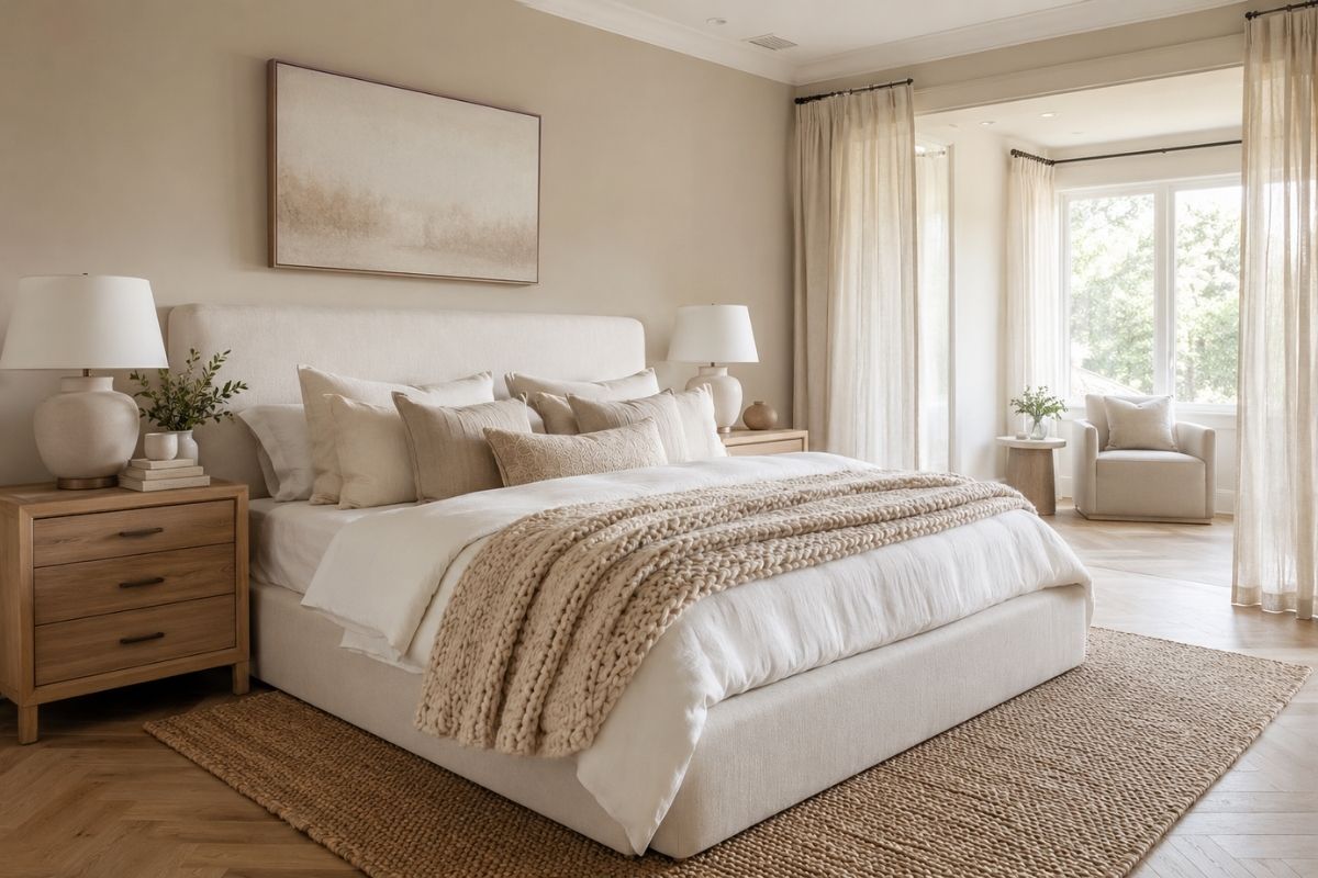
Neutral bedrooms are consistently one of the most searched design ideas — and consistently one of the most disappointing when executed without understanding a basic principle: neutrals are not all the same.
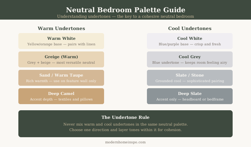
The difference between a bedroom that feels calm, warm, and put-together and one that feels dingy or clinical is almost always about undertone — the secondary color hidden inside the neutral you chose.
This guide explains how to identify undertones, which neutral schemes work in which conditions, and how to pair wall colors with bedding and furniture to get a cohesive result.
Why Undertone Matters More Than Color Name
Every neutral paint color has an undertone — a secondary color that becomes visible when the paint is on the wall and interacting with light.
A paint chip labeled “Light Gray” might have a blue undertone, a purple undertone, or a green undertone. In a bedroom with warm incandescent lighting, a blue-undertone gray will look cold and slightly lifeless. In a north-facing room with limited natural light, a green-undertone gray will look muddy.
How to identify the undertone:
- Look at the paint chip against a pure white surface. The difference between the chip and pure white reveals the undertone.
- Place the chip next to other neutrals you are considering. Undertone differences become obvious in comparison.
- Test the actual paint on the wall — at least a 12-inch square — and observe it at different times of day and under the lighting you will actually use.
Key Point
Never choose a neutral bedroom color from a paint chip alone under store lighting. Store lighting is rarely the same as bedroom lighting. Always test on the wall first.
Warm Neutral Schemes
Warm neutrals are the most practical choice for most bedrooms. They work with a wide range of furniture tones, pair well with warm artificial light (2700K LED), and create a calming atmosphere in both natural and artificial light.
Warm Greige
Greige — a blend of gray and beige — is the most versatile neutral bedroom color. The best warm greiges have a beige or taupe undertone with just enough gray to prevent them from reading as flat beige under bright light.
How to use it: Apply to all four walls. Pair with linen or cotton bedding in cream, taupe, or soft white. Use warm wood — oak, walnut, or similar — for nightstands and dresser. Add muted brass or brushed gold for lighting and hardware.
What to avoid: Cool-toned artwork or accessories that pull the room toward cool gray. Blue-green accent pillows that fight the warm undertone.
Specific paint options with LRV:
| Paint | Brand | LRV | Notes |
|---|---|---|---|
| Pale Oak | Benjamin Moore | 69 | Classic warm greige, versatile in most orientations |
| Accessible Beige | Sherwin-Williams | 58 | Slightly deeper, good in larger rooms |
| Skimming Stone | Farrow & Ball | 66 | Warm beige-grey, reads differently warm vs cool light |
| Elephant’s Breath | Farrow & Ball | 44 | Deeper greige, works as accent wall or in rooms with good light |
| Warm Buff | Little Greene | 65 | Neutral warm greige, minimal undertone shift |
Warm Cream / Off-White
Warm white is distinct from cool white. A warm cream has yellow or red undertones that prevent it from reading stark or clinical. Used in a bedroom with warm lighting, warm cream walls create a soft, almost glowing effect.
How to use it: Works best in rooms with good natural light. Pair with soft taupe or warm brown bedding to prevent the room from reading all-white. Warm wood furniture grounds the palette. One or two darker accent pieces — a charcoal cushion, a dark wood lamp — add contrast.
What to avoid: Bright white or cool-toned furniture that creates a harsh contrast. Too many white surfaces (walls + bedding + furniture) without variation in tone or texture.
Specific paint options with LRV:
| Paint | Brand | LRV | Notes |
|---|---|---|---|
| Pointing | Farrow & Ball | 77 | Warm off-white, slight yellow undertone |
| Wimborne White | Farrow & Ball | 83 | Lighter, cleaner warm white |
| Swiss Coffee | Benjamin Moore | 82 | Versatile warm cream, minimal undertone |
| Natural White | Sherwin-Williams | 83 | Clean warm white, works in most light conditions |
| Limestone | Little Greene | 79 | Pale warm cream with stone undertone |
Warm Taupe
Warm taupe is slightly darker than greige — it has more brown in it and reads more definitively as a color than a neutral. It works particularly well in larger bedrooms where a lighter greige might feel too pale.
How to use it: Use on all four walls or as a single accent wall behind the bed. Pair with cream or white bedding for contrast. Warm brass or bronze hardware. Natural linen textures.
What to avoid: Taupe can read too dark in small bedrooms with limited natural light. In those rooms, use it as an accent wall only.
Specific paint options with LRV:
| Paint | Brand | LRV | Notes |
|---|---|---|---|
| Smoked Trout | Farrow & Ball | 56 | Warm taupe with pink undertone |
| Mole’s Breath | Farrow & Ball | 46 | Deep warm greige, works on accent wall |
| Agreeable Gray | Sherwin-Williams | 60 | Warm grey-taupe, extremely versatile |
| Edgecomb Gray | Benjamin Moore | 63 | Slightly cooler taupe, handles most orientations |
Cool Neutral Schemes
Cool neutrals work in specific conditions — primarily rooms with abundant warm natural light or when a deliberately calm, minimal aesthetic is the goal.
Cool Gray
Cool gray — with blue, green, or purple undertones — works in south- or west-facing bedrooms with warm natural afternoon light that compensates for the cooler undertone.
How to use it: Pair with crisp white bedding (not cream — cream will fight the cool gray and look dirty by comparison). Chrome or brushed nickel hardware. Light wood or painted white furniture.
What to avoid: Warm amber lighting — a cool gray under 2700K warm LED looks dingy. Use 3000K to 4000K lighting in cool gray bedrooms to avoid the muddy appearance.
Specific paint options with LRV:
| Paint | Brand | LRV | Notes |
|---|---|---|---|
| Repose Gray | Sherwin-Williams | 60 | One of the most balanced cool grays, minimal undertone shift |
| Stonington Gray | Benjamin Moore | 59 | Classic cool blue-gray |
| Purbeck Stone | Farrow & Ball | 55 | Neutral cool gray, slight green undertone in some light |
| Manor House Gray | Farrow & Ball | 36 | Deeper cool gray, accent wall or high-light rooms only |
Blue-Gray
Blue-gray is a slightly more saturated cool neutral that introduces a hint of color into a neutral scheme without committing to blue. It reads as sophisticated and calm in rooms with good natural light.
How to use it: Use on one or two walls only — full blue-gray rooms can feel cold. Pair with white bedding and light wood furniture. Avoid warm-toned furniture or accessories.
Specific paint options with LRV:
| Paint | Brand | LRV | Notes |
|---|---|---|---|
| Parma Gray | Farrow & Ball | 56 | Classic blue-gray, works in good light |
| Borrowed Light | Farrow & Ball | 72 | Very pale blue-gray, works in limited light |
| Mount Rainier Gray | Benjamin Moore | 65 | Soft blue-gray with wide compatibility |
| Misty | Sherwin-Williams | 68 | Pale grey-blue, cooler than it appears on chip |
Greige: The Practical Choice
Greige deserves its own section because it is the most commonly recommended neutral bedroom color for a reason: it solves the specific problem most bedrooms face.
Most bedrooms have mixed lighting — some natural light, some warm artificial light in the evening. A pure gray looks cold under warm evening light. A pure beige can look flat and dated under daylight. Greige handles both situations better than either extreme.
The key is finding a greige with the right balance for your specific room:
| Room condition | Greige to use | LRV target |
|---|---|---|
| Limited natural light, north-facing | Warmer greige — more beige than gray | 65–75 |
| Good natural light, any direction | Standard warm greige | 58–68 |
| Warm natural light, south or west facing | Slightly cooler greige — natural light adds warmth | 55–65 |
| Very small bedroom | Lighter greige, avoid darkening | 65+ |
| Large bedroom | Slightly deeper greige for presence | 50–60 |
LRV (Light Reflectance Value) is a paint specification measure: higher LRV = lighter color. Most paint manufacturers list LRV on the product page. Values above 70 are light; 50–70 are mid-tone; below 50 are dark.
The same principle applies when choosing cream or taupe: for north-facing rooms, push the LRV higher (lighter) than you would in a south-facing room. The room’s natural light does part of the colour’s work in south-facing rooms; in north-facing rooms, it doesn’t.
For a full breakdown of how room orientation affects colour selection across all neutrals and non-neutrals, see Bedroom Colour Ideas.
Lighting and Neutrals
The single biggest factor in how a neutral bedroom looks is not the paint color — it is the lighting.
2700K warm white LED: This is the most flattering light temperature for warm neutral bedrooms. It adds warmth to cream, greige, and taupe walls, makes the room feel cozy in the evening, and complements warm wood tones. Use it for all bedside lamps and ambient lighting.
3000K neutral white: A reasonable middle choice. Slightly less warm than 2700K. Works with both warm and cool neutrals without exaggerating either.
4000K cool white or daylight: Avoid in neutral bedrooms designed for warmth. This temperature makes warm neutrals look yellow and cool neutrals look clinical.
Lighting Layer for a Neutral Bedroom
Do not rely on a single overhead light. Use:
- Ambient layer: A ceiling fixture with warm white bulbs (2700K)
- Task layer: Bedside lamps for reading — warm white, aimed down
- Accent layer (optional): A dimmer-controlled lamp in a corner to adjust evening ambience
A neutral bedroom with layered lighting at 2700K will feel warm and cohesive regardless of whether the wall color is cream, greige, or warm taupe.
Pairing Neutral Walls with Bedding and Furniture
Bedding
For warm greige or warm cream walls: Use linen or cotton bedding in natural linen, soft white, or cream. Avoid bright white (too stark) and cool blue-gray (fights the warm undertone). A layered look — duvet + coverlet + accent cushions — adds texture without adding color.
For cool gray walls: Use crisp white bedding. Cream bedding reads dirty against cool gray. Blue or blue-gray accent cushions are coherent. Avoid warm amber tones.
Furniture
Warm neutrals pair best with:
- Warm wood (oak, walnut, natural pine)
- Muted brass or bronze hardware
- White or off-white painted furniture (not bright white)
Cool neutrals pair best with:
- Light wood or painted white furniture
- Chrome or brushed nickel hardware
- Black or charcoal accent pieces for contrast
Rugs
A neutral bedroom rug should add texture rather than a new color. Best options:
- Jute or sisal (adds natural texture — works with warm neutral walls)
- Low-pile wool in cream, taupe, or warm gray
- Patterned rug using the same neutral palette (a pattern using two or three values of beige/greige is more interesting than a flat plain rug)
Rug size matters more than color in a bedroom: the rug should extend at least 18 inches beyond the bed on the sides and foot. A rug too small for the bed makes the room feel disconnected.
Common Mistakes
Choosing the neutral from a paint chip under store lighting. Fluorescent store lighting is not your bedroom lighting. The color will look different.
Using a neutral from a photo without accounting for the room’s light direction. A greige that looks perfect in a south-facing Pinterest bedroom may look gray and cold in your north-facing room.
Matching bedding to the wall color too closely. When walls, bedding, and furniture are too close in tone, the room reads flat. You need contrast between the wall and the bedding, even within a neutral palette.
Using cool gray in a bedroom with warm amber lighting. Cool gray + warm light = muddy brown-gray. Either change the light to a neutral or cool temperature, or choose a warmer neutral.
Adding too many accent colors. One or two accent tones are enough — a cushion in a muted rust or dusty green. Adding multiple accent colors defeats the calm quality of a neutral bedroom.
Frequently Asked Questions
- What is the most popular neutral bedroom color?
- Warm greige (a mix of gray and beige with warm undertones) is consistently one of the most popular neutral bedroom colors because it works in most lighting conditions and pairs naturally with wood, linen, and warm metal accents. Exact popular paint colors include Benjamin Moore Pale Oak, Sherwin-Williams Accessible Beige, and similar warm greige formulations.
- What is the difference between warm and cool neutrals?
- Warm neutrals have undertones of yellow, orange, pink, or red. They include beige, cream, greige, warm white, and warm taupe. Cool neutrals have undertones of blue, green, or purple. They include cool gray, blue-gray, and cool white. Warm neutrals tend to soften most bedroom lighting. Cool neutrals can feel clinical in low natural light.
- What neutral colors go with dark wood floors?
- Warm beige, warm greige, and soft cream work best with dark wood floors because the warm undertones complement the red and orange tones in most dark wood flooring. Cool gray on dark wood floors can create a cold, stark contrast. A warm white like a Swiss Coffee or Natural White also works.
- Can I use a neutral bedroom color in a north-facing room?
- Yes, but choose a warmer neutral than you would for a south-facing room. North-facing rooms receive less direct sunlight and tend to read cooler throughout the day. A warm greige or warm cream prevents the color from reading gray or cold. Test any paint sample in the room at multiple times of day before committing.