Best White Paint for Interior Walls: Warm Whites, LRV Guide, and Room-by-Room Picks
Quick Answer
For most interior walls: warm white with yellow or cream undertone — Farrow & Ball All White (LRV 84), Benjamin Moore White Dove (LRV 85), Sherwin-Williams Alabaster (LRV 82), or Dulux Natural Calico. These read as white in normal viewing conditions but produce warmth against timber floors, stone, and brass hardware. Avoid brilliant white on interior walls — the blue undertone clashes with warm materials and reads as stark under 2700K artificial light. LRV 75–85 is the practical target range for most interior white walls.
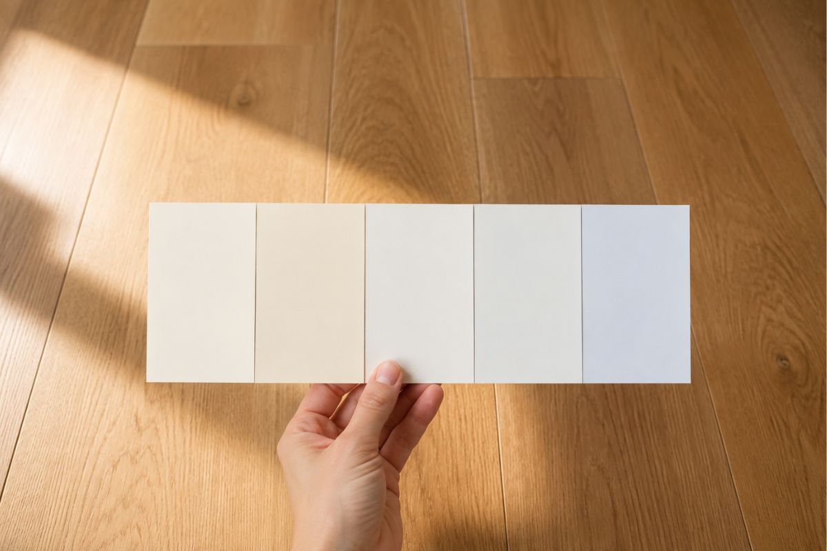
White is the most commonly used interior paint colour and, paradoxically, the most commonly chosen badly. The reason: white is not a single colour. Every white paint has an undertone — warm (yellow, pink, cream) or cool (blue, grey, green) — that only becomes visible when it interacts with the room’s light and the surrounding materials. A white that looks clean and bright in the tin, on the chip, or on someone else’s Instagram will behave completely differently in your specific room, with your specific floor and your specific light direction.
Why White Is Complicated
The white you’re looking at in the shop is lit by fluorescent or cool-LED commercial lighting, surrounded by a white display background, and viewed without any of the room’s fixed elements (floor, furniture, natural light) providing contrast. None of these conditions exist in your home.
What makes two whites look different on the wall:
- Undertone: the secondary colour impression in the pigment — warm whites contain yellow, orange, or pink; cool whites contain blue, grey, or green
- LRV: how much light the paint reflects — affects perceived brightness independently of undertone
- Finish: sheen level affects how the colour reads (higher sheen = slightly brighter, more reflective appearance)
- Adjacent materials: the same white reads differently against warm oak flooring vs cool grey tile vs white marble
The rule: identify the undertone of your floor and dominant furniture first. Then choose a white whose undertone is compatible, not conflicting.
LRV: What It Means in Practice
LRV (Light Reflectance Value) is a standardised measure of how much visible light a colour reflects, on a scale of 0 (pure black) to 100 (theoretical perfect white). Most interior whites sit between LRV 70 and LRV 90.
What LRV tells you:
| LRV Range | What It Means | Best For |
|---|---|---|
| LRV 85–92 | Very high reflectance — bright, slightly stark | Ceilings, very dark rooms, rooms with no natural light |
| LRV 75–84 | High reflectance — reads as clearly white, retains warmth | Most interior walls, open-plan spaces |
| LRV 65–74 | Moderate — reads as warm white or off-white | Period properties, rooms where stark white feels wrong |
| LRV below 65 | Off-white or near-white — visible colour character | Accent or feature use; cream rooms |
LRV in practice:
A higher LRV is not automatically better. In a room with strong south-facing light, an LRV 88 brilliant white can feel stark and glaring at midday. An LRV 78–82 warm white reads as calmer and more comfortable while still brightening the space. In a north-facing room, the higher the LRV the better — every point of reflectance helps compensate for the cool, limited light.
Where to find LRV: Listed on the technical specification sheet for most major paint brands. Farrow & Ball publishes LRV for all their colours. Benjamin Moore, Sherwin-Williams, and Little Greene also publish them. Dulux lists them in the technical data section.
Warm Whites: Best Options by Brand
These whites have yellow, cream, or pink undertones — they read as white in most conditions but produce warmth against natural materials and under warm artificial light.
Farrow & Ball
- All White (LRV 84): The most versatile F&B white. Slightly warm — not obviously cream, but avoids the blue cast of brilliant white. Works in most rooms including north-facing ones.
- Pointing (LRV 71): Warmer and creamier than All White — reads as off-white rather than white in strong light. Excellent in period properties and rooms with warm timber elements.
- Wimborne White (LRV 80): Slightly yellow-warm. One of the most popular UK kitchen cabinet whites — also works well on walls in rooms with good light.
- White Tie (LRV 78): Pale greige with warm undertone. Softer than All White — suits rooms where stark white would feel harsh.
Little Greene
- Loft White (LRV 87): Very pale but with a warm lean — the highest-LRV warm white in their range. Works well for rooms that need maximum brightness without the blue cast of brilliant white.
- Intelligent White (LRV 85): Clean, versatile warm white. Slightly less characterful than F&B but very adaptable.
- Slaked Lime (LRV 81): Pale warm cream. Best in period properties, traditional interiors, rooms with stone floors.
Dulux
- Natural Calico: Warm cream-white — the best Dulux alternative to Farrow & Ball Pointing. More affordable, available everywhere, excellent warmth.
- Magnolia: The original warm white — unfairly dismissed as generic. Still one of the warmest and most forgiving whites available. Very high LRV, warm pink-yellow undertone.
- Jasmine White: Slightly warmer than Natural Calico. Works particularly well in rooms with warm wood floors.
Benjamin Moore (US)
- White Dove (OC-17, LRV 85): Considered by many US designers as the best all-purpose warm white — warm enough to avoid the blue cast, neutral enough to work with almost any material palette.
- Chantilly Lace (OC-65, LRV 90): Very high LRV, slightly cooler than White Dove but warmer than brilliant white. Best for rooms that need maximum brightness.
Sherwin-Williams (US)
- Alabaster (SW 7008, LRV 82): Warm cream-white, extremely popular for interior walls and cabinetry. Works well with warm wood, stone, and brass.
- Shoji White (SW 7042, LRV 74): Noticeably warmer than Alabaster — reads as off-white in strong light. Best in rooms with warm materials.
Cool Whites: When They Work
Cool whites contain blue, grey, or green undertones. They do not work in most residential rooms but have specific conditions where they are the correct choice.
When cool whites work:
- South or west-facing rooms with strong warm light: The warm sunlight compensates for the cool undertone. A cool grey-white in a west-facing bedroom looks sophisticated at 3pm; the same colour in a north-facing room looks cold and grey.
- Alongside a cool-toned modern aesthetic: If the room has light bleached oak or grey-washed wood, cool stone countertops, and cool-toned accessories, a warm white will look slightly yellowed by contrast. A cool white works better.
- Ceilings throughout the house: Ceilings receive very little warm material adjacency — a cool bright white on the ceiling is standard practice and correct.
Cool white examples (and their conditions):
- Farrow & Ball Strong White (LRV 75): Cool undertone — more grey than white. Works in south-facing rooms and modern Scandi schemes.
- Dulux Pure Brilliant White: Extremely high LRV, noticeably blue undertone. Correct for ceilings and some exterior woodwork. Incorrect for interior walls in most homes.
- Benjamin Moore Simply White (OC-117, LRV 89): Slightly cool — often described as neutral but leans cool. Works in many settings due to very high LRV.
Room-by-Room White Guide
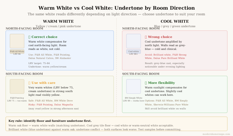
North-facing rooms — use the warmest whites. North-facing rooms receive cool, diffused, blue-quality light all day. Cool whites amplify this into something cold and unappealing. The warmest end of the white spectrum — Dulux Natural Calico, F&B Pointing, Sherwin-Williams Alabaster — counteracts the light’s coolness and makes the room liveable.
Avoid: cool greys, brilliant white, anything with a blue or green lean.
South-facing rooms — more flexibility. South-facing rooms have warm, generous light that can handle a wider range of whites, including slightly cooler options. A clean neutral white (F&B All White, Benjamin Moore White Dove) looks its best here. Avoid very warm near-whites (Dulux Magnolia, F&B Pointing) in south-facing rooms — in strong afternoon light these can read as distinctly yellow.
East-facing rooms — warm white required in the afternoon. East rooms are bright and cool in the morning, dimmer and warmer in the afternoon. A warm white performs better in the afternoon condition when the room is used most.
West-facing rooms — warm whites at their best. West-facing rooms receive golden afternoon light that enriches warm tones. F&B Wimborne White, Dulux Natural Calico, and similar warm-cream whites look particularly beautiful in a west-facing room on a summer afternoon.
Living rooms — Farrow & Ball All White (LRV 84) or Benjamin Moore White Dove (LRV 85). High-LRV warm whites that read as clean and bright while retaining enough warmth to work with timber furniture, rugs, and soft furnishings.
Bedrooms — go warmer than you think necessary. Bedrooms are used primarily at night under artificial light (2700K LED or incandescent). Under warm artificial light, cool whites read as grey. Warmer options — F&B Pointing, Sherwin-Williams Alabaster, Dulux Natural Calico — read correctly in the evening and create a more restful atmosphere.
Kitchens — depends on cabinetry colour. White or warm-white cabinets need a wall white that does not compete with them. In most white kitchens: use the same warm white on walls as on cabinets, or one tone warmer. In kitchens with coloured cabinets (sage, navy, charcoal), a clean warm white wall is the correct choice.
Hallways — the highest-traffic room in the house, typically north-lit and used at all hours. Use the warmest practical white: Dulux Natural Calico, F&B Pointing, or similar. The hallway is also where dirty handprints accumulate — eggshell or satin finish (not flat) is essential.
Children’s rooms — use a durable white in eggshell or satin. Washability outweighs aesthetics. Dulux Easy Clean in Natural Calico, or any warm white in eggshell finish, balances warmth with practical wipe-down ability.
Wall White vs Trim White
One of the most consistent mistakes in white room design: using the same white on walls and woodwork. This creates a room where nothing visually anchors — every surface is the same tone and the architectural details disappear.
The rule: Trim should be slightly brighter and crisper than the wall. The wall white is the room’s neutral background; the trim white defines the edges, corners, and structural details.
How to pair them:
| Wall White | Trim White |
|---|---|
| F&B Pointing (LRV 71, warm cream) | F&B All White (LRV 84, clean warm white) |
| F&B All White (LRV 84) | Dulux Brilliant White eggshell |
| Dulux Natural Calico | Dulux Pure Brilliant White in eggshell |
| Sherwin-Williams Alabaster | Sherwin-Williams Extra White in semi-gloss |
| Benjamin Moore White Dove | Benjamin Moore Chantilly Lace in eggshell |
Finish difference matters: Wall white is typically applied in flat or matt. Trim white is applied in eggshell (interior woodwork) or satin (high-wear areas). The finish difference creates a visual distinction even when the colours are similar — the trim catches light differently from the walls, defining the architectural form.
Ceiling white: The ceiling should be the same colour as the trim, or a lighter version of the wall white. A warm white wall with a brilliant white ceiling creates an undertone conflict at the wall-ceiling junction. Use the same warm white family throughout — wall in F&B Pointing, trim and ceiling in F&B All White, for example.
The Brilliant White Problem
Brilliant white — the default white sold at every DIY retailer, the white that goes on every new build wall, the white that all other whites are implicitly compared against — is the wrong white for interior walls in most residential rooms.
Why:
Brilliant white has a deliberately blue-cooled undertone. This was practical in the era of incandescent lighting, which produced very warm (2700K+) light — the blue undertone in the white compensated for the yellow warmth of the bulb, producing a neutral appearance. Under modern 2700K LED lighting, the blue undertone is no longer compensated — it reads as a grey-blue cast, particularly noticeable in rooms without strong natural light.
The specific problems:
- Against timber floors: The blue undertone of brilliant white walls creates a visible undertone conflict with warm oak, pine, or walnut floors. Both surfaces look slightly wrong; neither looks correct.
- Under 2700K artificial light: Evening lighting makes brilliant white walls appear grey-blue rather than white. The room reads as colder than it should.
- Fingerprints and marks: The very high LRV of brilliant white (typically LRV 88–92) means every shadow, mark, and surface imperfection is visible. Warm whites at LRV 78–84 are more forgiving.
- In north-facing rooms: The cool-quality light of a north-facing room amplifies the blue undertone of brilliant white into something distinctly cold.
Where brilliant white is correct:
- Ceilings — particularly in rooms with very warm-toned walls, where a warm ceiling would read as yellowed
- Some external woodwork (where durability and brightness are the priority)
- Rooms with a deliberate cool-minimal aesthetic where consistent cool tones are the design intent throughout
Frequently Asked Questions
- What is the best white paint for living room walls?
- Warm white with a yellow or cream undertone: Farrow & Ball All White (LRV 84), Benjamin Moore White Dove (LRV 85), Dulux Natural Calico, or Sherwin-Williams Alabaster. Test against your flooring and furniture before committing — warm white reads differently against cool grey vs warm oak floors. North-facing living rooms need the warmest end of the white spectrum; south-facing rooms can handle slightly cooler whites without going clinical.
- What does LRV mean in paint?
- LRV stands for Light Reflectance Value — a measure of how much light a colour reflects on a scale of 0 (pure black) to 100 (pure white). Most interior whites fall between LRV 70–90. Higher LRV means a brighter, more reflective surface. In small or dark rooms, LRV 80+ makes a visible difference to perceived brightness. In rooms with strong natural light, an LRV 75–80 warm white reads as warmer and less glaring than a high-LRV brilliant white.
- Should walls and trim be the same white?
- No. Wall white and trim white serve different functions and should differ. Trim (skirting, architraves, door frames) needs a harder, slightly crisper white in eggshell finish — the slight contrast defines the architectural details. If the wall is Farrow & Ball Pointing (warm cream-white), the trim might be F&B All White. If the wall is Dulux Natural Calico, the trim might be Dulux Brilliant White in eggshell. The trim should be slightly brighter and crisper than the wall.
- Why does brilliant white look bad on interior walls?
- Brilliant white has a blue undertone. Under 2700K warm LED or incandescent lighting — which is standard for residential rooms — the blue undertone reads as a grey-blue cast on the walls. Against warm flooring (timber, terracotta tile, warm stone), brilliant white creates an undertone conflict that makes both surfaces look worse. Brilliant white works on ceilings (which have minimal contact with warm materials), some exterior woodwork, and in rooms with very neutral daylight. Not on interior walls.