Kitchen Colour Schemes: Four Palettes That Work and How to Build Them
Quick Answer
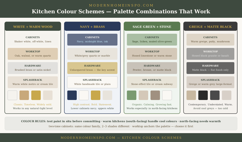
The four kitchen colour schemes that work consistently: (1) White or off-white cabinets with warm wood worktop and brass hardware — the most universally applicable; (2) Navy lower cabinets, white uppers, brass hardware, white quartz worktop — bold but time-tested; (3) Sage green cabinets with warm stone worktop and pewter hardware — the dominant contemporary choice; (4) Warm greige cabinets with black worktop and matte black hardware — contemporary and understated. In all cases: choose the worktop first, build the cabinet colour around it, and test paint samples in the actual kitchen in actual light before ordering.
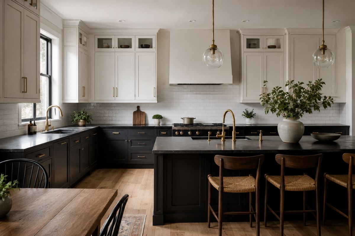
A kitchen colour scheme involves more surfaces in simultaneous view than almost any other room: cabinet fronts, worktop, splashback, walls, floor, and hardware are all visible at once. A colour that looks good in isolation can clash with an adjacent material that wasn’t present in the showroom.
The approach that works is sequential: anchor with the most expensive and least changeable surface, then build the palette outward. For the theory behind undertone matching and how to run the 48-hour colour test, see Kitchen Color Ideas.
How to Build a Kitchen Palette
Step 1: Choose the worktop first
The worktop is the most expensive surface, the hardest to change, and the dominant horizontal surface in the kitchen. Warm materials (oak, walnut, warm quartz with movement) pull the whole scheme warmer. Cool materials (white quartz, grey granite, concrete) pull it cooler. The cabinet colour must complement — not fight — the worktop.
Step 2: Choose cabinet colour
With the worktop chosen, select the cabinet colour that works with it. Warm worktop + lighter cabinet (white, off-white) = the most common and versatile combination. Cool worktop + dark cabinet = strong contrast — works with white, navy, charcoal. Test shortlisted paint colours in the actual kitchen (painted on a large card taped to the door) in real light conditions across morning, midday, and evening.
Step 3: Choose the splashback
The splashback should either recede (same tone as the wall or cabinet) or contrast deliberately (a different material or colour that acts as the kitchen’s feature element). Avoid splashbacks that are almost-matching but slightly off — they read as a mistake rather than a decision.
Step 4: Choose hardware last
Hardware (door handles, tap, extractor hood finish) should unify the palette, not introduce a fourth colour family. One hardware finish throughout. Warm tones (oak worktop, warm white cabinets) → brass or brushed gold. Cooler tones (white quartz, grey cabinets) → brushed nickel, chrome, or matte black.
Four Schemes That Work
1. White + warm wood + brass
The most widely sold kitchen combination globally. White is high-contrast against the warm wood worktop; the warmth of the wood prevents the white from reading as clinical; brass hardware introduces warmth without competing with the cabinets.
Cabinet colours: Farrow & Ball ‘Pointing’ or ‘Wimborne White’ for a warm, soft feel. Dulux ‘Natural Calico’ or ‘Jasmine White’ for a good-value warm white. Benjamin Moore ‘White Dove’ is the standard US warm white equivalent.
2. Navy lower + white upper + brass + white quartz
The boldest combination that remains broadly appealing. The navy lower cabinets ground the kitchen and provide a strong visual anchor; the white upper cabinets maintain brightness at eye level; white quartz worktop provides clean contrast against the navy; brass handles are the accent that completes the scheme. Without brass hardware, this combination reads as colder.
Cabinet colour range: Farrow & Ball ‘Hague Blue’ or ‘Stiffkey Blue’; Little Greene ‘Basalt’ for deeper navy; Dulux Heritage ‘DH Inky Blue’.
3. Sage green + stone worktop + pewter or bronze hardware
The dominant contemporary kitchen choice since 2022. Sage green is a muted, grey-green that is naturalistic and calm. Stone worktops (honed limestone, travertine, warm-toned quartz) complement the green’s organic quality. Bronze or pewter hardware continues the earthy, natural register.
Works better in warm-light rooms (south or west-facing) than in cold north-facing kitchens where sage can go muddy. Colours: Farrow & Ball ‘Mizzle’, ‘Vert de Terre’, ‘Card Room Green’; Little Greene ‘Aquamarine Deep’.
4. Warm greige + black worktop + matte black hardware
The most contemporary of the four. Greige cabinets (warm grey-beige) provide a quiet background that is not cold and not overtly traditional. A black or very dark worktop (honed black granite, black quartz, dark basalt) provides a sharp contrast. Matte black hardware throughout ties the scheme. The greige must be warm-toned — a cool grey paired with black reads as cold and corporate.
Colours: Farrow & Ball ‘Elephant’s Breath’, ‘Purbeck Stone’, ‘Hardwick White’; Little Greene ‘Pale Pewter’.
Budget Paint Alternatives
Not every kitchen project can stretch to Farrow & Ball or Little Greene prices. The same schemes work at every budget — the undertone matching matters more than the brand. Budget alternatives that deliver the same result:
| Scheme | Premium option | Mid-range | Budget |
|---|---|---|---|
| Warm white | F&B Wimborne White | Dulux Natural Calico | Crown Ivory (warm white range) |
| Sage green | F&B Mizzle | Dulux Sage Advice | B&Q Colour Mix sage match |
| Navy | F&B Hague Blue | Dulux Night Sailing | Rust-Oleum Cabinet Paint Navy |
| Warm greige | F&B Elephant’s Breath | Dulux Warm Pewter | Crown Greige (neutral range) |
The key for budget paints: buy a kitchen-specific or cabinet-specific formulation (eggshell or satin, hard-wearing, wipe-clean). Standard wall emulsion on cabinet doors deteriorates quickly — the finish matters as much as the colour.
Two-Tone Cabinets
Two-tone (different colours on upper and lower cabinets) is one of the strongest contemporary kitchen approaches.
Visual weight at the right level
Darker colour on the lower cabinets anchors the kitchen at floor level — where weight is appropriate. Dark colour on upper cabinets raises the visual weight to ceiling height and can make the kitchen feel heavy. Lower dark + upper light is the correct distribution.
The standard approach
Lower cabinets: the statement colour (navy, sage, charcoal, green). Upper cabinets: white or off-white — ideally the same off-white as the walls, which integrates the uppers into the room rather than making them a separate element. Same hardware finish on both — the hardware connects the two colour levels visually.
Same family, different depth
A subtler two-tone: same colour family on upper and lower, but lower cabinets 2–3 shades deeper. Sage lowers with a pale sage-grey upper. Navy lower with a light blue-grey upper. This reads as sophisticated without the high contrast of the standard approach.
Island as accent
If the kitchen has an island, the island is an opportunity for a third tone — often the deepest. A sage kitchen with white uppers and a dark green or charcoal island reads as deliberate because the island is a distinct piece from the run cabinets.
Light Direction and Colour
North-facing kitchens
Get cold, indirect light throughout the day. Cool-toned colours amplify the coldness — cool grey, pure brilliant white, and blue-grey all make north-facing kitchens feel clinical and unwelcoming. Warm options: warm white, greige, sage (which has enough grey to handle indirect light without going muddy), or navy (which reads as rich rather than cold in indirect light).
Avoid in north-facing kitchens: cool grey (Pavilion Grey without warmth), pure brilliant white, pale blue-green tones that go grey in low light.
South-facing kitchens
Warm, bright, direct light — particularly in the afternoon. Can support cooler tones that would be too cold in a north-facing kitchen. Handles bold colours (navy, dark green) without them feeling oppressive. Can make very warm tones (terracotta, warm yellow) look orange in afternoon sun — test under afternoon conditions specifically.
East and west-facing kitchens
East-facing: bright morning light, dimmer afternoon. West-facing: dim morning, warm golden afternoon light (which can shift warm tones toward orange — particularly terracotta and warm yellow in west-facing kitchens).
Never choose colour from a brochure
Kitchen light is specific — the position of the window, the ceiling colour, the reflection off the worktop all affect how the cabinet colour reads. Paint a large sample (A3 or bigger) on a card taped to the actual cabinet door and observe across at least a week in different times of day.
Hardware as Accent
Hardware — handles, tap, extractor trim — is the accent layer that ties the kitchen palette together.
Brass and unlacquered brass
The most popular hardware finish since 2019. Lacquered brass maintains its bright gold finish indefinitely. Unlacquered brass develops a patina over time — it dulls and warms, developing character. Unlacquered is the better choice for traditional and organic kitchens; lacquered for contemporary schemes.
Pairs best with: warm whites, sage green, navy, off-whites. Less successful with cool greys and cool whites.
Matte black
Strong, graphic, contemporary. Works with white, greige, and navy. Any water marks or fingerprints on matte black are visible immediately — factor into maintenance expectations.
Brushed nickel and satin chrome
The safest contemporary choice — cool, understated, doesn’t compete. Works with virtually any cabinet colour. More neutral than brass but also less distinctive.
Pewter and bronze
Natural-toned finishes that work particularly well with organic palettes (sage, stone, natural wood). Develop character over time. Not as widely stocked as brass or black — order samples before committing to a full kitchen.
Colours to Avoid (and Why)
Cool grey (without warmth)
The most overused and least satisfying kitchen cabinet colour of the 2015–2020 period. Cool grey reads as cold and corporate in most UK kitchens — particularly north-facing ones. If grey appeals, choose a grey with a warm undertone (Farrow & Ball ‘Mole’s Breath’ has brown in it; ‘Purbeck Stone’ leans warm) rather than a neutral or blue-grey.
Pure brilliant white
Glare-inducing under artificial kitchen light. Harsh shadows from spotlights on pure white doors look unpleasant in the evening. Warm white handles light much better and ages more gracefully with the minor scuffs and marks that kitchen doors inevitably accumulate.
High-saturation colours
Vivid greens, bright yellows, vivid orange, hot red: visually demanding, date quickly, and are difficult to live with long-term in a room used three times a day. Muted and low-saturation versions (sage not lime green; dusty terracotta not vivid orange) are significantly more liveable.
Yellow-toned greens
Olive green and warm yellow-green cabinet colours shift significantly under different light conditions. Under warm artificial light in the evening they can read as distinctly brown-yellow. Test specifically under the kitchen’s artificial lighting — not just in daylight.
Frequently Asked Questions
- What is the most popular kitchen colour in the UK?
- White remains the most common kitchen cabinet colour in UK homes, followed by grey (which peaked around 2018–2020 and has since declined in popularity) and increasingly sage green and navy blue for coloured kitchens. The trend away from cool grey toward warmer tones (greige, sage, warm white) has been consistent since 2021. Among the colour options, sage green has the strongest current momentum in new kitchen installations.
- How do I choose a kitchen colour scheme?
- Start with the worktop material and colour, since it's expensive to change and anchors the palette. Then select cabinet colour that complements it. Choose hardware last (brass, chrome, black, pewter) to unify the palette. Test paint samples in the actual kitchen in morning, midday, and evening light before committing. The main mistake is choosing cabinet colour from a brochure or chip — kitchens have specific light conditions that change colour significantly.
- Do two-tone kitchen cabinets still work?
- Two-tone cabinets remain one of the strongest kitchen design approaches: darker lower cabinets (navy, sage, charcoal) with white or light upper cabinets. The visual logic is that heavy colour at floor level grounds the kitchen rather than making it feel wall-heavy. This approach lets you use a statement colour while maintaining brightness at eye level and ceiling. Use the same hardware finish on both upper and lower cabinets for coherence.
- Should kitchen units be the same colour as the walls?
- Not usually. Matching cabinets to walls (same colour throughout) creates a flat, low-contrast kitchen that reads as small and undifferentiated. The wall colour above the cabinets is typically kept neutral (white, warm white, light grey) with the cabinet colour providing the kitchen's primary tone. The exception: a fully integrated kitchen where cabinets extend to ceiling and the wall behind the island is the only visible wall — here matching tones can work.