Bathroom Color Ideas: Palettes That Work, Proportions That Matter, and How Tiles Change Everything
Quick Answer
Bathroom colour works differently from other rooms because tile and grout colour have a greater visual weight than paint. Light, warm neutrals (pale sage, warm grey, warm white) work in all sizes. For small bathrooms, keep the tile, wall, and ceiling in the same tonal family — no contrasting horizontal band. For larger bathrooms, a dark colour on all walls and ceiling (moody bathroom approach) works if natural light is adequate. Always check tile undertone before committing to wall paint.
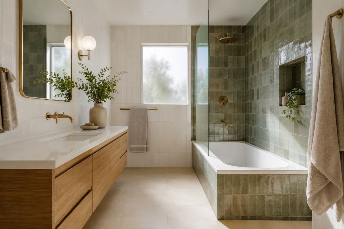
Bathroom colour is more complex than wall colour in other rooms because tile introduces a large, fixed surface with its own undertone and character. The paint on the wall and the tile on the floor and shower must work together — and getting their undertones to align requires attention before committing to either.
Colour and Tile Interaction
The tile in a bathroom is rarely neutral. White tiles are not all the same white — some have pink undertones (common in Crema Marfil limestone), some have grey undertones (common in white quartz-effect porcelain), some have warm cream undertones (common in traditional metro tiles). Each interacts differently with the wall paint.
Check undertone before selecting wall paint
The fastest way: take a white piece of card and hold it against the tile. If the tile looks pink or cream against the card, it has warm undertones. If it looks blue or grey, it has cool undertones.
Select wall paint with the same undertone direction. A warm pink-cream tile needs a warm-undertone wall paint. A cool grey-white tile needs a cool-undertone wall paint.
The grout amplifies the palette
If the grout is a contrasting colour (dark grey on white tiles), the grid created by the grout pattern is a significant visual element. In a small bathroom, this grid makes the room read as smaller. In a large bathroom, it adds graphic structure. In both cases, the grout colour becomes a de facto palette element — factor it in.
Tile percentage determines palette dominance
In a fully tiled bathroom (floor + shower walls + possibly all walls), the tile colour is the dominant palette element, not the paint. In a bathroom with only a tiled floor and tiled shower zone, the wall paint colour is dominant. Design accordingly — if 60% of surfaces are tiled, choose the tile first and the paint to complement it.
Small Bathroom Palettes
Warm white throughout
The most reliable small bathroom palette: a warm white tile (with cream undertone) on the floor and shower walls, the same warm white paint on all other walls, white or very pale ceiling. The tonal unity reads as one continuous surface — no horizontal interruptions, no colour blocks that read as boundaries.
Tile option: a 60×60cm large-format warm white porcelain or a classic white metro tile in a brick bond. Grout in warm white or pale cream to match.
Pale sage green
Currently the most popular alternative to white in smaller bathrooms. Sage has enough warmth to avoid reading as clinical but enough lightness to expand the space. Works particularly well with warm timber accents (oak vanity top, warm wood shelf) and brass hardware.
For small bathrooms: sage walls + white/off-white tile floor and shower + brass hardware. Keep the sage consistent — walls and any painted surfaces, with tile as the light counterpoint.
Paint options: Farrow & Ball Mizzle (classic mid-sage), Little Greene Sage (lighter, works in low-light rooms), Dulux Sage Advice (mid-market equivalent), Crown Willow (budget option). Test against the specific tile before committing — sage reads differently under cool morning light vs warm artificial evening light.
Soft warm grey (greige)
A warm grey-beige (no blue-grey) applied to walls, with a warm white tile palette. Works well in bathrooms with limited natural light — it’s light enough to maximise brightness but has enough warmth to avoid the cold-clinical quality of pure cool grey.
Paint options: Farrow & Ball Elephant’s Breath (warm grey with pink undertone), Dulux Warm Pewter, Little Greene Pale Lucie.
Large Bathroom Palettes
Two-tone wall treatment
In a larger bathroom, a painted upper half with a tiled lower half (below the dado line, typically 100–120cm) works well. The tile needs to be a substantial material — stone, Zellige, or large-format porcelain — not a small standard tile that reads as a budget choice above the floor.
Most effective: a deep, warm paint colour above (sage green, warm terracotta, dusty blue) with a white or cream tile below. The paint colour creates character; the tile at the wet zone handles the practical requirement.
Bold wall colour with white tile
A statement colour on all walls — sage green, deep teal, warm terracotta, forest green — with white or cream tiles on the floor and shower. This is the most popular direction for principal bathrooms where the design goal is a character room rather than a neutral space.
Requirements for success: adequate natural light, one or two windows minimum; warm 2700K artificial lighting (not cool overhead lighting); a material accent (warm wood, brass) to ground the colour.
Natural stone palette
Large-format natural stone (limestone, travertine, or marble) on floors and possibly walls creates a cohesive palette with almost no additional colour decisions. The stone’s natural variation provides visual interest; the wall paint (usually warm white or warm grey) simply echoes the stone’s undertone.
Dark and Moody Bathrooms
Dark bathrooms — all walls in charcoal, forest green, deep navy, or warm black — create a luxurious, spa-like quality when done right. The requirements:
Lighting
The most important factor. A dark bathroom without adequate lighting is oppressive. At minimum: a good natural light source (window, skylight, or borrowed light through glass), plus warm artificial lighting (wall sconces flanking the mirror, not a single overhead downlight), plus the ability to create ambient lighting in the evening (dimmable circuit).
Fixtures and surfaces
Dark walls need high-contrast fixtures to avoid the room looking muddy. White sanitary ware, warm brass hardware, a light-toned countertop, a white or cream ceiling — these provide the contrast that makes the dark walls read as a dramatic choice rather than a dark room.
The ceiling question
Dark walls with a white ceiling read as normal-ceiling-height. Dark walls with a dark ceiling read as enveloping and cocoon-like — either luxurious or oppressive depending on room height and lighting. In a room with 240cm+ ceilings, a dark ceiling works; below that, keep the ceiling white or very pale.
Accent and Seasonal Colour
Towels as colour
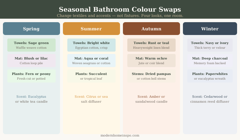
Towels provide the cheapest and most reversible colour in a bathroom. In a neutral palette bathroom, towel colours can be changed seasonally — sage and terracotta for autumn, white and navy for summer. This is the only element of bathroom decor with a realistic seasonal change cycle.
Hardware finish as accent colour
Brass, matte black, brushed nickel — the hardware finish in a bathroom has similar weight to a paint accent colour. In a white bathroom, brushed gold hardware is effectively the room’s accent tone. This is the most elegant accent approach: colour through metallic surface rather than paint.
Plants as colour and life
A fern, pothos, or orchid in a bathroom with a window adds green and organic form. In a pale neutral bathroom, a plant provides the single most impactful ‘colour’ without committing to a palette decision.
Grout as a Colour Decision
Grout is a palette element, not an afterthought. In a small bathroom, matching grout to tile colour (white grout on white tile, warm grey grout on stone tile) creates a near-seamless surface with minimal grid visibility. In a larger bathroom, contrasting grout — charcoal on white metro, warm rust on cream zellige — adds deliberate graphic structure that reads as a design choice.
The most common bathroom tiling regret: white metro tile with charcoal grout in a small bathroom. The dark grid covers every surface and makes the room read smaller. In small bathrooms, pale grout is strongly preferred.
For the full grout technical decisions — epoxy vs cement grout, grout width by tile format, and shower floor specifications — see Bathroom Tile Ideas.
Frequently Asked Questions
- What is the best colour for a small bathroom?
- Light, warm neutrals — pale sage green, warm white, or soft warm grey — applied consistently to walls, floor, and ceiling. The colour should be tonally consistent (no contrasting bands or two-tone wall treatments) and the tile grout should match the tile colour rather than contrasting with it. Pale colours with consistent tonal treatment read as significantly more spacious than contrasting combinations.
- Can you have a dark bathroom?
- Yes, in a bathroom with adequate natural light (at least one window, ideally skylight) or as a deliberate design choice in an en suite with good artificial lighting. Dark bathrooms — charcoal, deep sage, navy, forest green — are increasingly popular and can feel luxurious when well-executed. The risk is that a dark bathroom without sufficient light feels oppressive rather than moody.
- Does white make a bathroom look bigger?
- White is the most reliably space-expanding choice, but warm white (cream undertone) works better than brilliant white (cool undertone). Brilliant white in a bathroom can read as clinical and shows every mark. Warm white — walls, tiles, and ceiling in the same tone — creates the most expansive small bathroom effect.
- What wall colour goes with grey bathroom tiles?
- The key is the undertone of the grey tile. Cool grey tiles (blue-grey undertone) pair with cool whites, soft blue-grey walls, or charcoal. Warm grey tiles (greige/taupe undertone) pair with warm whites, warm sage, or warm taupe walls. Mixing a warm grey tile with a cool grey wall paint creates a subtle dissonance that's hard to diagnose but persistent.