Bedroom Colour Ideas: Palettes, Paint Placement, and What Actually Helps Sleep
Quick Answer
Best bedroom colours for sleep: warm neutrals (greige, warm white, soft taupe) and muted tones (dusty blue, sage green, terracotta in low saturation). Avoid high-saturation colours above the bed — they create visual stimulation inconsistent with sleep. Dark colours (charcoal, deep navy, forest green) work in bedrooms if the ceiling is kept light and there is sufficient natural light. Accent wall behind the headboard is the most effective single wall treatment — it grounds the bed without surrounding the room in colour.

The bedroom is the one room where colour choice has functional consequences beyond aesthetics. A living room can accommodate a wider range of stimulating colours because it’s used for active engagement. A bedroom is used for rest and transition out of the day — the colour environment should support that, not compete with it.
This doesn’t mean bedroom colours must be bland. Deep, rich colours can work exceptionally well in bedrooms. The question is where you place them and how they relate to light.
Colour and Sleep
The stimulation argument
High-saturation colours — bright red, vivid orange, electric blue — produce physiological arousal. In a bedroom context, this works against wind-down and sleep onset. The research on colour and sleep is not as strong as the interior design industry sometimes implies, but the general principle holds: visually quiet, low-saturation environments are more conducive to sleep than visually active, high-stimulation ones.
Warm vs cool
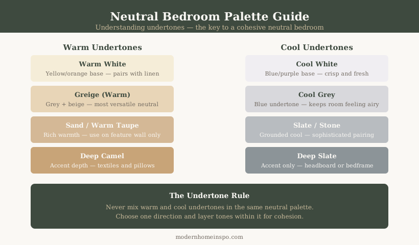
Warm tones (greige, taupe, dusty terracotta, warm sage) tend to feel more settled and restful than cool tones (cool grey, stark white, cool blue-grey). This is particularly true in UK bedrooms, which often have limited natural light. Cool tones can read as cold and institutional — particularly in north-facing rooms.
The spectrum that works
The best-performing bedroom colours share two qualities: low saturation (muted, not vivid) and warmth in their undertone. This includes warm whites, greiges, soft taupes, dusty blues (not bright blue), muted sage, and dusty terracotta or pale blush. Deep colours at high saturation — charcoal, forest green, navy — can also work when kept to one or two walls.
Neutral Palette Options
For a full breakdown of specific neutral schemes — warm greige, cream, taupe, sage, and blue-grey — with undertone identification, LRV references, pairing guides, and room condition matching, see Top Neutral Bedroom Color Schemes That Actually Work.
The two things that determine which neutral works in your bedroom: undertone (warm vs cool) and how much natural light the room gets. A warm greige that looks perfect in a south-facing bedroom can read as cold and murky in a north-facing one. Test on the actual wall at multiple times of day before committing.
The principle that applies across all neutral choices: the colour should do nothing. If you are aware of the wall colour while lying in bed trying to sleep, it is working against you. Neutrals should disappear into the room.
Dark Bedroom Colours
Dark bedroom colours — charcoal, deep navy, forest green, aubergine — have become significantly more common and they can work well with the right approach.
The conditions for dark colours
Natural light: south and west-facing rooms handle dark walls better than north-facing rooms. In a north-facing bedroom, a very dark colour can make the room feel oppressively heavy during the day. Test the colour at multiple times of day before committing.
Ceiling: keep the ceiling white (or a pale version of the wall colour, 2–3 shades lighter). A dark ceiling in an average UK bedroom height (2.4m) reads as oppressively low. High ceilings (3m+) can take a dark ceiling — lower ceilings cannot.
Bedding and soft furnishings: contrast against the dark wall. Pale linen (off-white, natural, warm white) against a dark wall creates the right balance. Dark bedding on a dark wall flattens the room visually.
Dark colour placement
The accent wall behind the headboard is the best introduction to dark colour in a bedroom — it creates impact without surrounding the room. If confident, take it to all four walls, accepting the specific conditions above.
The dark bedroom advantage
A well-executed dark bedroom creates an enveloping, cocoon-like quality that is the opposite of clinical. It feels private, deliberate, and atmospheric. Forest green walls with pale linen bedding and brass lamp bases is one of the strongest bedroom combinations currently.
Accent Wall Placement
The headboard wall
The wall behind the headboard is the only effective accent wall in a bedroom. It creates a natural focal point aligned with the bed — the room’s primary piece. A feature wall on any other wall (side walls, window wall, or the wall opposite the bed visible as you enter) reads as arbitrary rather than intentional.
Full wall, not a panel
Paint the accent wall from skirting to ceiling in one colour — not a half-height panel, not a geometric shape, not a colour-blocked rectangle. A full wall reads as a considered design decision. A partial paint reads as indecision.
Colour depth for accent walls
The accent wall can be 3–4 shades deeper than the other walls — or a completely different colour family entirely. Both work. The most common approach: three walls in a warm neutral (greige, warm white) and the headboard wall in a deeper version of the same tone, or a contrasting muted colour (sage, dusty blue, terracotta).
Wallpaper as an accent wall
A botanical, linen-texture, or geometric wallpaper on the headboard wall can replace a paint colour. The same placement rule applies: only behind the headboard, and full wall from skirting to ceiling. Avoid over-patterned wallpaper in a bedroom used for sleep — it creates visual stimulation.
Ceiling Colour
Standard ceiling: warm white
Most bedrooms benefit from a warm white ceiling in the same family as the wall colour — not pure brilliant white (creates a cold, hard contrast with warm wall tones). Use the same paint manufacturer’s white recommendation — Farrow and Ball ‘All White’ or ‘Pointing’; Dulux ‘Warm White’ — for coherence.
Lowering the ceiling
A ceiling painted in a mid-tone matching the wall colour (or 1–2 shades deeper) creates an enclosing, canopy-like effect. Effective in rooms with high ceilings (2.7m+); overpowering in rooms with standard height ceilings.
The fifth wall
In bedrooms, the ceiling is the primary surface visible when lying down. A ceiling in a restful tone — soft blush, pale sage, warm greige — is experienced differently than a cold white. Worth considering in rooms designed for rest.
Colour with Natural Light
North-facing bedrooms
Get cool, indirect light throughout the day. Colours with cool undertones (blue-grey, cool white, lavender) will read as cold and grey. Warm tones (greige, soft terracotta, warm white, warm sage) counteract the coolness of the light. Avoid dark colours on all four walls in a north-facing bedroom.
South-facing bedrooms
Get warm, direct light — generous and variable throughout the day. Handle a wider range of colours, including cooler tones that would read as cold in a north-facing room. Sage, dusty blue, and white (including cooler whites) all work. Can manage dark colours on all four walls better than north-facing.
East-facing bedrooms
Bright morning light, dimmer afternoon. A good fit for warm colours that are energising in the morning without the heaviness of dark tones in afternoon light.
West-facing bedrooms
Dimmer morning, warm afternoon light. The warmest and most golden light of any orientation — works particularly well with warm tones (terracotta, warm white, greige). Dark colours with yellow undertone can turn noticeably orange in late afternoon light — check this when testing paint samples.
Testing before committing
Paint two A4-sized patches of shortlisted colours on the actual wall (not on a piece of board moved around the room). Observe at morning light, midday, early evening under artificial light, and in low winter light. A colour that looks perfect in a brochure or on a chip can look entirely different in situ.
Frequently Asked Questions
- What is the best colour for a bedroom?
- Warm neutrals — greige, warm white, soft taupe — are the most universally effective bedroom colours. They are visually quiet (low stimulation), work with most bedding and furniture combinations, and read differently across natural light conditions without becoming harsh. Muted blue and sage green are the most popular non-neutral bedroom choices and both have research association with relaxation. Avoid high-saturation, bright colours (red, orange, hot pink) directly above and around the sleeping zone.
- Can you use dark colours in a bedroom?
- Yes — dark colours (charcoal, deep navy, forest green, aubergine) can work well in bedrooms, particularly on an accent wall behind the headboard. The key conditions: keep the ceiling white or a pale version of the wall colour (not dark); ensure there is sufficient natural light (south or west-facing rooms handle dark walls better than north-facing rooms); and keep bedding and soft furnishings lighter so the room doesn't read as uniformly dark.
- Should I paint an accent wall in my bedroom?
- An accent wall behind the headboard is the most effective single wall treatment in a bedroom. It grounds the bed visually, creates a natural focal point, and allows use of a deeper or richer colour without overwhelming the room. The wall should be painted the same colour as the headboard wall from ceiling to skirting board — not a panel or partial paint. The three remaining walls can remain neutral.
- What colours should I avoid in a bedroom?
- High-saturation, bright colours directly around the sleeping zone: bright red (physiologically activating), pure white (creates glare with morning light and reads as clinical), orange (high energy stimulation), and cool-toned very bright colours like electric blue or lime green. These are fine in other rooms but work against the purpose of a bedroom. Avoid very cool greys without warm undertones — they read as cold and clinical in bedrooms, particularly in rooms without much natural light.