Bedroom Wall Décor Ideas: Gallery Walls, Single Art, and What to Avoid
Quick Answer
The most effective bedroom wall décor is a single large artwork or a symmetrical gallery wall above the bed, hung so its centre sits at 150cm from the floor (eye level when standing). The artwork width should be 60–75% of the headboard width. Anything narrower reads as an afterthought; anything wider dominates.
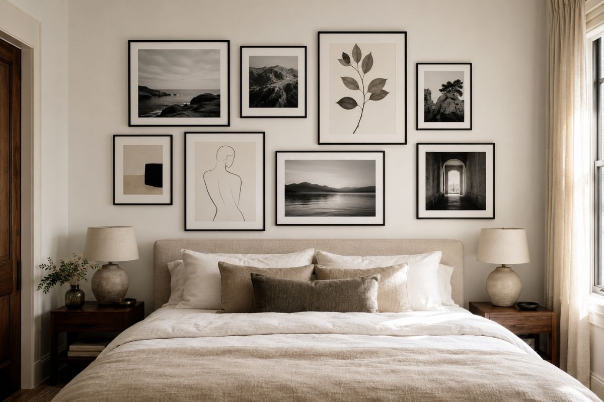
The Sizing Rule
The most common bedroom wall décor mistake is scale. A print bought from an online shop at A3 size — which sounds large on a product page — arrives and promptly disappears against a bedroom wall. Bedroom walls are typically 3–4m wide and 2.4m tall. An A3 print (42×30cm) on that wall is effectively invisible.
The sizing rule for above-the-bed placement: artwork width should be 60–75% of the headboard width. For context:
| Bed size | Typical headboard width | Target artwork width |
|---|---|---|
| Double (135cm) | 150–160cm | 90–120cm |
| King (150cm) | 165–180cm | 100–135cm |
| Super king (180cm) | 195–200cm | 120–150cm |
For a gallery wall arrangement, the total boundary of the arrangement should reach this width — not each individual piece.
Height placement: The centre of the artwork or gallery arrangement should sit at 150cm from the floor — the standard eye-level-when-standing position. Exceptions: in rooms with very low ceilings (under 2.2m), drop to 140cm. In rooms with high ceilings (3m+), you can raise to 160cm.
Above a bed specifically: The bottom of the frame (or lowest frame in a gallery) should clear the headboard by 15–20cm. This gap prevents the art from appearing to sit on the headboard and allows the composition to breathe.
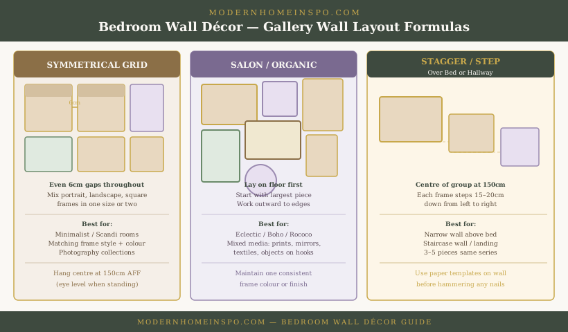
Gallery Wall Formulas
Formula 1: Symmetrical Grid
A symmetrical grid uses consistent spacing between all frames (6–8cm is a good target) and typically mixes portrait, landscape, and square frames while keeping to one or two frame sizes.
The visual logic is clean: even gaps, consistent frame finish (all black, all gold, all white), mixed orientations. Works beautifully with photography collections, botanical prints, or any series with a consistent aesthetic.
How to plan it: Lay all frames on the floor first. Photograph from above. Adjust until the arrangement feels balanced. Use paper templates taped to the wall before hammering any nails.
Formula 2: Salon / Organic
A salon arrangement — inspired by 19th-century Parisian salons where paintings were hung floor-to-ceiling touching edges — uses varied frame sizes and orientations placed intuitively rather than in a grid.
The key to making this look intentional rather than chaotic: start with the largest piece and build outward, and keep one consistent element throughout (usually frame finish or colour). The arrangement can include non-framed elements: small mirrors, wall-mounted objects, ceramic tiles, macramé.
Boundary discipline: Define the outer boundary of your arrangement before starting. The outer edge of the outermost frames should form an approximate rectangle. Arrangements that trail off at the edges look unfinished.
Formula 3: Stagger / Step
Three to five pieces of similar size, stepped diagonally downward or upward across the wall. The visual centre of the arrangement sits at 150cm; the pieces fan out from there in a staircase pattern, each stepping approximately 15–20cm below or above the next.
Works well in narrow spaces above a bed or along a staircase. The repeating size and the clear direction creates order from what could look random.
Above the Bed
The wall above the bed is the single most visually prominent wall in a bedroom — it’s what you look at when lying down and what a visitor sees when entering the room. It deserves the most considered decision.
Option A: One large piece. A single large artwork 100–150cm wide is the cleanest solution. It reads as a confident, deliberate choice. The artwork should have enough visual weight for the scale — a large white canvas with a small motif disappears. Look for art with colour that anchors to the bedlinen palette.
Option B: Gallery arrangement. A curated gallery above the bed (following Formula 1 or 3) adds personality and can grow over time. The risk: it needs consistent maintenance — a gallery that becomes uneven or acquires one mismatched frame looks neglected.
Option C: Oversized mirror. A large mirror above the bed has practical and visual advantages. It reflects light and makes the room feel larger. Ensure the mirror is securely fixed — a heavy mirror above a sleeping area needs proper wall fixings into studs or masonry, not just adhesive strips.
Option D: Architectural detail. A carved wood panel, a piece of textile art, or a large botanical pressed framing — non-standard objects can be as effective as conventional art and add texture that printed artwork can’t achieve.
Mirrors in the Bedroom
Mirrors serve two functions in a bedroom: practical (dressing) and spatial (expanding perceived space). The best bedroom mirror placements:
Full-length mirror: Wall-mounted at 170–180cm height (so the top reaches above your head when standing), or freestanding leaning against the wall. Ideally positioned where daylight falls across it rather than behind it — a mirror facing a window creates glare, not reflection.
Above the dresser: A mirror above a dresser creates the vanity function. Width should be 60–80% of the dresser width. Mount it so the bottom edge is approximately 5–10cm above the dresser surface.
As a gallery element: A decorative ornate mirror as part of a salon gallery arrangement adds depth and reflects light. Keep it proportional — a very large ornate mirror overwhelms smaller art around it.
What to avoid: Multiple mirrors on the same wall facing each other create an infinite-reflection effect that can feel disorienting in a bedroom. Two full-length mirrors on opposite walls is rarely a good idea.
Feature Wall Options
Wallpaper on headboard wall: A dedicated wallpaper on the bed wall — a botanical print, geometric, textured grasscloth, or subtle repeat — creates a designed backdrop that frames the bed. It works when the wallpaper scale is chosen relative to room size (large-scale patterns in small rooms overwhelm).
Paint in a contrasting depth: A slightly deeper or warmer tone on the headboard wall than the other three walls reads as an intentional design decision, not an unfinished paint job. The contrast should be subtle (same hue family, 2–3 shades darker) unless you’re going for a bold feature wall.
Panelling: MDF or timber panelling on the headboard wall — painted the same colour as the wall or in a contrasting tone — adds architectural interest without requiring art. Combine with a picture rail height divide (panels below the rail, painted wall above) for a traditional look.
Fabric / upholstered panel: A floor-to-ceiling fabric panel behind the bed — the same fabric as the headboard, or a complementary tone — unifies the headboard and wall into a single considered element.
What to Avoid
Too-small art: A group of small prints scattered across a large wall without arrangement logic looks accidental. Either commit to a proper gallery arrangement with planning, or go up in scale.
Quote prints: Motivational quote prints in script fonts are the most consistently dated bedroom wall choice. Typography-based art works when the typeface is considered and the words have personal meaning — not when they’re a mass-produced “Live, Laugh, Love” alternative.
Hanging without a plan: Nails added one at a time, each correcting the last misplacement, creates a wall of holes and a composition that looks assembled by accident. Always lay on the floor first, photograph, then use paper templates before fixing.
Hanging too high: The single most common hanging mistake. Art hung at ceiling-height level looks institutional. The centre at 150cm applies in almost every residential context.
Clashing frames: Mixing gold, silver, black, and white frames in the same gallery without a unifying theme creates visual noise. Choose one finish per gallery arrangement.
Styling and Finishing
Ledge shelves as art: A deep picture ledge (12–15cm deep) allows art to be changed without rehanging. Layer frames in front of each other, vary heights, mix framed prints with small objects (ceramic vase, plant, small sculpture). Particularly useful in rental properties where wall damage is restricted.
Lighting the art: Adjustable picture lights — a small directional spotlight mounted above the frame — elevate bedroom art to something more gallery-like. Worth considering for one or two key pieces in a master bedroom.
Plants alongside art: A trailing plant (pothos, string of pearls) in a wall-mounted planter beside or below an art grouping adds organic texture that softens a flat arrangement. Keep it tidy — a neglected plant undermines the arrangement.
Frequently Asked Questions
- How high should art be hung in a bedroom?
- The centre of artwork should sit at 150cm from the floor — approximately eye level when standing. This applies to single pieces and to the visual centre of a gallery arrangement. Above a bed, the bottom of the frame should be 15–20cm above the headboard.
- What size art should go above a bed?
- The artwork (or gallery arrangement) should be 60–75% of the headboard width. For a king bed with a 160cm headboard, this means an artwork or arrangement that's approximately 100–120cm wide. Narrower feels timid; wider overwhelms the bed.
- Can you put a gallery wall above a bed?
- Yes, and it works well when the arrangement has a defined outer boundary (treat the overall group as a single rectangle) and the total width follows the 60–75% headboard rule. The bottom of the lowest frame should sit 15–20cm above the headboard.
- What should not go on bedroom walls?
- Avoid: too many small pieces scattered without arrangement logic, motivational quote prints in inappropriate fonts, frames at different heights with no relationship to each other, and oversized art in small rooms where it dominates. Also avoid hanging anything directly above the headboard that could fall onto the bed.
- Is wallpaper better than art for a bedroom feature wall?
- Depends on commitment level. Wallpaper on the headboard wall creates a designed backdrop that unifies the room — but it's a permanent decision. Art can be moved and updated. For renters, a large-scale artwork or removable peel-and-stick wallpaper is the flexible solution.