Kitchen Color Ideas: Undertone Rules and How to Test Before You Commit
Quick Answer
Kitchen colour success depends on undertone matching: every colour in the kitchen — cabinets, countertop, wall, tiles — must share the same undertone direction (warm or cool). The most common expensive mistake: warm cream cabinets paired with a cool blue-grey quartz countertop. They fight each other's undertones and neither looks right. Test paint on A4 card at countertop height, view in morning and evening light, tape it to the cabinet for 48 hours before ordering. For specific palette combinations (navy, sage, greige, white), see Kitchen Colour Schemes.
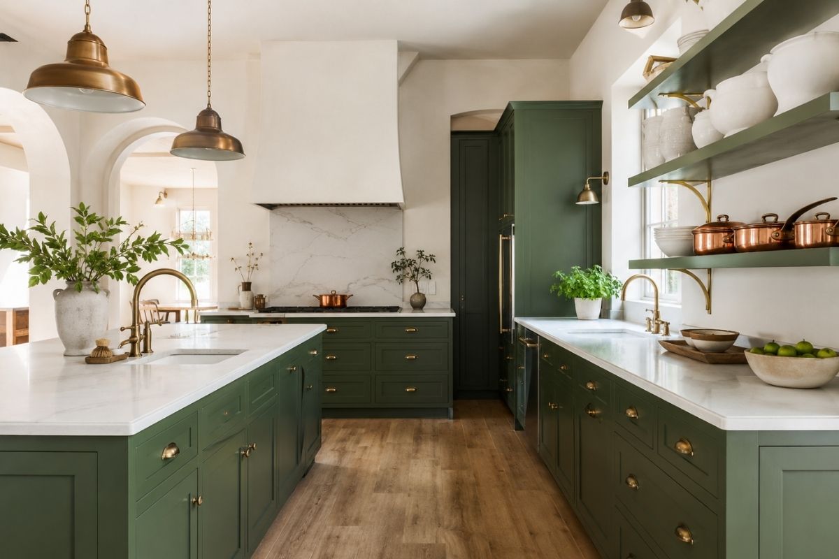
Kitchen colour decisions are permanent in the sense that repainting cabinets is a significant undertaking — not like changing cushion covers. Getting it wrong means either living with it or respraying or refacing the cabinets, which runs to thousands of pounds. The stakes make it worth understanding the principles properly before committing.
This article covers the underlying theory: undertone matching, reading warm vs cool families, and the testing process that eliminates regrets. For specific palette combinations (navy, sage, greige, white kitchens) and step-by-step palette building, see Kitchen Colour Schemes.
The Undertone Rule
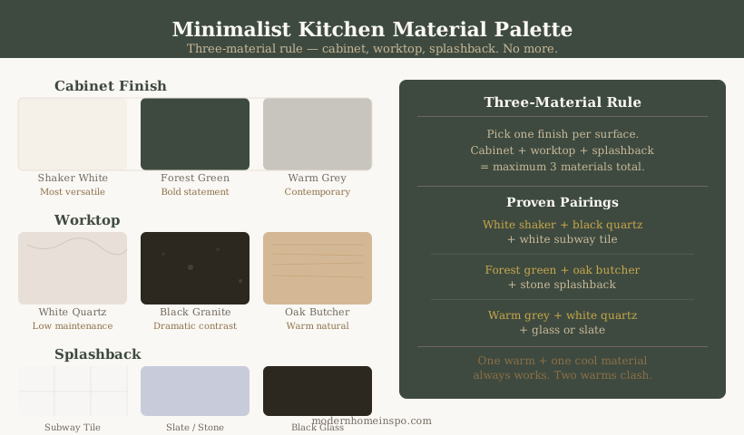
Every colour has an underlying tone — warm (red, yellow, orange base) or cool (blue, green, purple base). The cardinal rule of kitchen colour: every element in the room must share the same undertone direction.
Why undertone clashes fail
A warm cream cabinet with a cool blue-grey countertop creates a visual tension that most people notice as “something is off” without being able to name it. The two colours fight each other’s undertones, making each look wrong in a way that’s hard to pinpoint.
The most common clash in UK kitchens: warm painted cabinets (cream, warm white) with a grey quartz countertop that has cool blue-grey undertones. Both elements may look fine in isolation. Side by side, neither does.
The second most common: warm oak countertop paired with cool white flat-panel cabinets. The oak looks orange; the white looks icy. Each makes the other worse.
Undertone is not the same as light or dark
Warm and cool describe the colour family, not the depth. A pale dusty sage is warm if it has a yellow-green base; the same value in a blue-green base is cool. A dark charcoal can be warm (brown base) or cool (blue base). You can’t judge undertone from depth alone — you have to test against a known warm or cool reference material.
Warm vs Cool Family Guide
Warm undertone family
Cabinets: cream, warm white, butter yellow, warm grey (brown-base), terracotta, sage green with yellow base, warm navy (red-base blue). Countertops: cream quartz, warm beige stone, warm-veined quartzite, oak butcher block, buttery Calacatta marble. Hardware: unlacquered brass, lacquered brass, brushed gold, oil-rubbed bronze, warm copper. Walls: warm whites (Farrow & Ball All White, Pointing, Wimborne White), warm off-whites, warm greige.
Cool undertone family
Cabinets: pure white (blue-base), cool grey (blue-grey), charcoal with blue-cast, slate, blue-grey, cool navy (blue-base). Countertops: cool white quartz, cool grey granite, blue-grey limestone, stainless steel, concrete grey. Hardware: matte black, brushed nickel, polished chrome, gunmetal, satin stainless. Walls: cool whites, cool greys, blue-greys, stone grey.
The rule: do not mix families. Warm cream cabinets need warm countertop, warm hardware, and warm wall paint. Cool grey cabinets need cool countertop and cool or neutral hardware. Every element that is visible simultaneously must share the same family.
The one exception: Deep matte black hardware reads as neutral and crosses families — it works in both warm and cool kitchens without creating a clash. Polished chrome does not have this neutrality; it reads distinctly cool.
How Light Affects Undertone
Light is not passive in a kitchen — it actively shifts how undertones read. The same paint in two different rooms can appear to belong to different colour families.
Warm artificial light (2700–3000K LEDs, incandescent)
Amplifies warm undertones — creams glow, brass hardware looks richer. Cool colours become slightly warmer: a cool grey can read as almost neutral under warm kitchen downlights. This is why some cool palette kitchens look better in the evening than by day.
Daylight (5000–6500K, north-facing windows)
Reveals cool undertones starkly. A warm cream that looks inviting under artificial light can look flat or slightly jaundiced in cold north light. Cool greys become very cold. This is why north-facing kitchens need warmer-toned palettes than south-facing ones to feel welcoming.
Direct sunlight (south or west-facing, afternoon)
Can shift warm tones toward orange — particularly terracotta, warm yellow, and some sage greens. A warm buttery yellow cabinet that looks perfect in a north-facing showroom can read as distinctly orange-yellow in a south-facing kitchen on a bright afternoon.
The practical implication: Always test paint samples under both the actual kitchen’s daylight AND its artificial lighting. A sample that passes the daylight test can fail at 6pm under downlights, and vice versa.
How to Test Colour
Never use a sample pot directly on the cabinet
The existing cabinet colour influences how the sample reads. Even a white cabinet affects a sample painted directly on it. Paint the sample on white A4 card or a large sheet of lining paper, cut it to at least 30×30cm, and tape it next to — not on — the cabinet surface.
Test at multiple times of day
- Morning (8–10am): Natural light at its most neutral — closest to how the colour was designed to be read.
- Midday: Strongest light, often slightly cooler. Reveals whether the colour holds.
- Late afternoon: Warm directional light. This is when warm-toned kitchens look their best and when cool-toned rooms start to feel cold.
- Evening under artificial light: The most important test for a kitchen that’s used at dinner time. Completely different reading from daylight.
A colour that passes all four time periods is a reliable choice. One that only looks good at noon is not.
Tape the sample at countertop height
Position the sample card at the same height as the cabinet door — not at eye level on a blank wall. The adjacent countertop surface will influence how the colour reads, which is exactly the relationship you’re testing.
Live with it for 48 hours minimum
Tape the painted card to the cabinet for two full days. What seems like an obvious choice at first glance often reads differently after you’ve passed it thirty times in different light conditions and different moods. The 48-hour test eliminates most colour regrets.
Test adjacent to the countertop sample
If you’re also deciding on a countertop, tape the cabinet sample and the countertop sample side by side at countertop height. The combination test reveals undertone clashes that neither sample shows in isolation. This is the single most important test — two beautiful samples that fight each other are the root of most kitchen colour regret.
Buy 2–3 adjacent shades
If unsure between a sage green and a slightly deeper sage: buy both plus the shade between them. Paint all three on separate cards, tape them side by side. Living with all three for 48 hours usually makes the right choice obvious and eliminates the “did I pick the right one?” doubt.
Colours That Age Badly
Greys with cool blue undertones (2015–2022 era)
The dominant kitchen colour of that period — grey shaker cabinets, chrome hardware, grey quartz worktops — has dated significantly. It reads as builder-grade now in most contexts. If this describes your current kitchen and you’re considering a repaint, warm tones (greige, sage, warm white) are the natural next move.
Stark brilliant white (cool-base)
Pure cool white on cabinets shows fingerprints harshly, reads as clinical under artificial light, and clashes with almost every warm countertop material. Warm white (cream or yellow pigment) achieves the clean look without the harshness and is significantly more forgiving to maintain.
Bright yellow and vivid orange
High-energy colours that feel exciting in a showroom and exhausting three months in. They also interact badly with food colours under their reflected light — vegetables look wrong, meat looks odd. The muted versions (dusty mustard, warm terracotta) are significantly more liveable.
Trendy seasonal colours
Terracotta had a strong 2019–2022 run. Dusty pink appeared in 2020–2023. Sage green is peaking now. Reserve trend colours for accessories and walls where they can be changed without cost — not for cabinetry. The test: would this colour have been fashionable 15 years ago, and will it be fashionable in 15 years? Warm whites, navies, and soft greens pass this test. Terracotta cabinets in their peak-trend year do not.
Yellow-toned greens
Olive green and warm yellow-green cabinet colours shift significantly under different light conditions. Under warm artificial light in the evening, they can read as distinctly brown-yellow rather than green. Test these colours specifically under your kitchen’s artificial lighting — not just in daylight — before committing.
Colour Psychology in the Kitchen
The kitchen is used three times a day in high-focus activities (cooking, clearing up) as well as social situations (eating, conversation). Colour affects both the task experience and the social atmosphere — and these two contexts have different requirements.
For task use (cooking, preparation):
Cooler, more neutral tones support focus and don’t intrude on the visual assessment of food colours. This is why professional kitchens are stainless steel and white — high visual contrast with food makes judgment easier. At home, this suggests that very warm or vivid cabinet colours can slightly impair food colour assessment, though the effect is modest.
For social use (dining, conversation):
Warm tones — cream, sage, warm white — create the welcoming, relaxed atmosphere that makes eating a pleasure. Cool tones (cool grey, very white) can feel slightly clinical at the dinner table.
The resolution most kitchens use:
Warm cabinet tones (cream, sage, warm white) for the social warmth, combined with good-quality neutral overhead lighting at 3000K (slightly cooler than the 2700K used in living rooms) which supports task visibility without making the room feel like an office. This combination serves both uses well.
Frequently Asked Questions
- What is the most timeless kitchen cabinet colour?
- White — specifically warm whites with cream or yellow undertones (not cool blue-whites). White has been the most consistently popular kitchen cabinet colour for over 40 years across every design era. It reads clean, maximises light reflection, and pairs with every countertop and hardware option.
- Is navy blue a good kitchen colour?
- Yes, for lower cabinets or as the primary colour in a room with good natural light. Navy with warm brass hardware, a white or warm stone countertop, and white or cream uppers is one of the most proven combinations. Avoid cool-toned navy (with blue-grey undertones) as it reads dark and cold.
- What colour should kitchen walls be if cabinets are white?
- The same family as the cabinet white. If the cabinets are warm white (cream undertone), the wall should be a warm white or warm off-white — not a cool grey or pure brilliant white, which will make the cabinet white look yellow by comparison.
- Does kitchen cabinet colour affect resale value?
- White and light neutrals are safest for resale — they appeal to the widest buyer pool. Coloured kitchens (navy, green, dark grey) can enhance resale if they're well-executed and fashionable at the time of sale, or hurt it if the colour reads as dated or jarring. White is never the wrong choice for resale.