Living Room Wall Decor Ideas: What Works, What Doesn't, and How to Hang It Right
Quick Answer
For living room wall decor, centre artwork at 150cm from floor (eye level seated), choose one piece at least 60–70% of the sofa width above it, or a gallery wall with a unified frame finish and minimum 6–8cm between frames. Statement mirrors should be at least 90cm in any dimension to have spatial impact. The biggest mistake is hanging art too high — most pieces should sit 15–20cm above furniture directly below them.
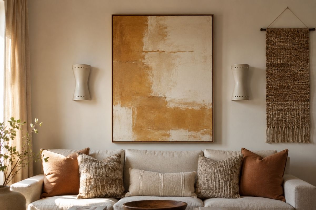
Wall decor is where most living rooms either come together or fall apart. The furniture can be well chosen, the palette balanced, and the layout thoughtful — but poorly positioned or poorly scaled wall decor undoes all of it. A piece hung too high, a gallery wall with inconsistent frames, a mirror that’s 60cm in a 4m room: each makes the whole space feel off without the viewer being able to name why.
Above the Sofa
The wall above the sofa is the most prominent wall surface in most living rooms. It’s the first thing guests see when they enter and the backdrop to every conversation. It needs to be handled deliberately.
One large piece
The most resolved approach for most rooms. A single large canvas or print (at least 90–100cm wide, ideally 120–150cm in a standard room) reads as intentional and calm. It gives the eye one clear focal point.
Sizing rule: the artwork should be 60–75% of the sofa width below it. A 220cm sofa calls for artwork at least 130cm wide. Going smaller looks like the art was hung before the sofa arrived.
Material options in order of visual impact:
- Original artwork or quality print on canvas (no glass, no reflection)
- Large-format photographic print (mounted or framed with museum glass)
- Textile panel or tapestry (adds warmth, texture, and absorbs sound)
- Oversized mirror (see section below)
What to avoid directly above a sofa
Heavy frames with glass create reflection problems — you’ll see the opposite room in the glass when seated. Shelves above sofas are a safety concern and collect dust in the prime view line. Multiple small frames at sofa height look tentative rather than confident.
Gallery Walls
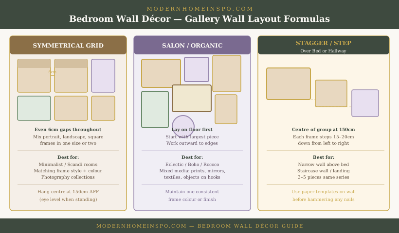
Gallery walls work when three conditions are met: unified frame finish, consistent spacing, and the overall shape reads as a deliberate rectangle or organic cluster — not a random scatter.
Frame finish
Choose one metal finish (all black, all brass, all natural wood) or mix two finishes that you’re already using elsewhere in the room. Mixed frame colours — natural wood + black + gold + white — in the same gallery wall reads as collected-from-charity-shops even when the prints are beautiful.
Matte black is the most versatile and currently safest choice. Natural oak works in Scandinavian and warm-modern rooms. Ornate gilded frames only if the room commits to a more traditional or eclectic direction.
Spacing
6–8cm between frames for a tight, curated look. 10–12cm for a more relaxed gallery feel. Anything under 5cm looks crowded; anything over 15cm loses the visual grouping and the pieces read as separate items again.
Layout approach
Start with your largest piece slightly left of centre (the eye enters from left to right). Build outward with smaller pieces. Step back every few frames — what reads as balanced from 30cm away often looks lopsided from across the room.
Paper template method: cut paper to the size of each frame, tape to the wall with painter’s tape, adjust until satisfied, then hammer nails through the paper. Removes all guesswork.
Gallery wall sizing
The overall footprint of the gallery wall grouping should follow the same 60–75% of sofa width rule as a single piece. The group, viewed from across the room, should read as a coherent mass, not a collection of individual items scattered across a large wall.
Mirrors as Decor
A mirror is the one wall element that does double work: decor and space expansion. It reflects light from windows and makes a room feel deeper.
Sizing for impact
Minimum 90cm in any dimension for spatial effect. A 60cm round mirror above a console is decorative; it doesn’t meaningfully expand the room. A 120cm round mirror or a 90×150cm rectangular mirror does.
Positioning for depth
Place opposite or at 45° to the main window. The mirror will reflect the window light and the view through it, creating a sense of depth and bringing the outdoors inside. Avoid placing directly opposite the room entrance — it reflects the viewer entering, which reads as strange.
Frame choice
Mirrors are an opportunity to introduce material contrast. A natural rattan or wood frame in a modern room adds warmth. A slim brass frame reads elegant without being ornate. An arched mirror has become a contemporary classic — the curve softens rectangular room geometry.
The TV Wall as Decor
The TV wall is the most-viewed wall in most living rooms — and the most neglected from a decor perspective. Most people mount a TV and call it done, leaving a large black rectangle floating on a bare wall.
The TV wall can be treated as a designed surface that incorporates the TV rather than apologising for it.
Full-wall media panel
A floor-to-ceiling panel of painted MDF or built-in joinery in the same colour as the wall. The TV recesses into it or mounts flush with it. The panel absorbs all cables, the media unit, and additional storage. Painted the wall colour, the TV appears to float in an architectural surface rather than hang from a bare wall.
The gallery-wall TV surround
Art arranged around the TV — above, beside, and at the same visual level — incorporates the screen into a curated wall composition. Key rule: no artwork directly above the TV where it will be obscured in the peripheral view during viewing. Position pieces beside and at least 30cm above the screen. Use black or dark frames that create visual continuity with the black TV bezel.
Feature wall colour or panelling
Painting the TV wall a different tone from the rest of the room (a deeper version of the room’s neutral, or an accent colour) frames the TV as part of a deliberate composition. Wall panelling (board and batten, or picture rail moulding) on the TV wall adds architectural detail that makes the flat screen look intentional rather than incidental.
Cable management — mandatory, not optional
A wall-mounted TV with a visible cable loop is one of the most common visual inconsistencies in decorated rooms. Options in order of permanence and cost: cable channel (painted to match wall, cheapest), in-wall cable routing through a conduit (moderate), or cable-free TV via wireless HDMI transmitter. The result in all cases is the same — a TV wall that looks designed.
Other Wall Treatments
Architectural panelling
Picture rail moulding, wall panelling (board and batten), or painted geometric panels on a single accent wall. These are permanent investments that transform the wall itself rather than adding objects to it. Works best on the main focal wall (TV wall or fireplace wall), not above the sofa.
Wall-mounted shelving
Floating shelves work above a console or in an alcove, not above the sofa. They allow living displays of books, plants, and ceramics. The risk is overloading — shelves with 15 small objects look cluttered. Keep to the rule of three: max 3 objects per 60cm of shelf.
Textiles
A woven wall hanging, macramé panel, or large-format tapestry adds texture that no flat artwork can match. Particularly effective in boho, Scandi, and warm-modern rooms. Hang from a visible dowel rod for an intentional, artisanal look.
Plants on the wall
Wall-mounted plant holders or trailing plants on wall-mounted shelves bring life and movement to walls. A pothos or philodendron trailing from a high shelf creates the kind of layered, organic quality that styled rooms have. Requires accessible watering.
How to Hang It Right
The universal height rule
Centre of artwork at 150cm from the floor. This is eye level when standing (standard gallery practice) and reads correctly whether you’re seated or standing in the room.
Exception: when artwork is directly above furniture, it should be 15–20cm above the furniture’s highest point (sofa back, console top, fireplace mantel) — regardless of whether this puts the centre at exactly 150cm. Connecting the artwork to the furniture below it is more important than the universal rule.
Large pieces over heavy furniture
Safety first: use two wall anchors into studs for anything over 2kg. A canvas over 90cm wide should always have two hanging points. Confirm the wall anchor type is appropriate for plasterboard or masonry.
The paper template method
For gallery walls or oversized pieces, cut kraft paper to the exact frame dimensions, tape it to the wall, and live with it for a day before committing. What looks balanced from one angle often reveals itself as off-centre or too high when you see it from across the room or at a different time of day.
D-ring vs sawtooth hanging
D-rings (two per frame) are more stable and prevent the piece from rotating. Sawtooth hangers are fine for small frames (under 3kg) but become unreliable for heavier or larger pieces. For anything going above a sofa, use D-rings and two picture hooks.
Frequently Asked Questions
- How high should art be hung above a sofa?
- 15–20cm above the top of the sofa back. This connects the artwork to the furniture below it rather than making it float in the middle of the wall. The centre of the piece should land around 150cm from the floor.
- How big should art be above a sofa?
- The piece (or gallery wall grouping) should span 60–75% of the sofa width. If your sofa is 220cm wide, aim for artwork 130–165cm wide. Smaller than 60% looks undersized; wider than 80% looks overwhelming.
- How many pieces should be in a gallery wall?
- 5–9 pieces is the most manageable range. Fewer than 5 lacks visual weight; more than 12 becomes visually chaotic without significant planning. An odd number tends to look more balanced than even.
- What's the most common wall decor mistake?
- Hanging art too high. Most people hang pieces at standing eye level, which means they float in the upper half of the wall, disconnected from the furniture below. Art should relate to the room, not the ceiling.